Support strong Canadian climate journalism for 2025
As the world prepares for the make-or-break climate conference in Paris this fall, each nation is expected to announce new climate targets. Last week, Canada became the 37th nation to do so.
Canada announced a 2030 target of 30 per cent less climate pollution than in 2005.
Here are three key facts that put Canada's new pledge into context:
1) The Good — For the first time, Canada made a new climate commitment that was as ambitious as their previous one. In the past, each new climate pledge was significantly weaker than the one before. The decision to sustain the same level of ambition this time is a welcome break from a discouraging trend.
2) The Bad — Unfortunately for humanity, to escape a Pandora's Box full of dangerous climate changes, the world's major climate polluters need to significantly increase their efforts. Both of Canada's major trading partners, the Americans and the Europeans (EU-28), stepped up to the challenge and promised to double how fast they would cut emissions. Canada, despite also being one of the world's top ten climate-polluting nations, didn't.
3) The Ugly — Canada is currently failing to meet its climate promises. Canadian emissions are running too high to meet our current 2020 climate target. Our climate pollution has now increased for four straight years. Much worse, our current policies are so weak that our emissions are projected to keep rising far into the future.
My chart below illustrates all three points.

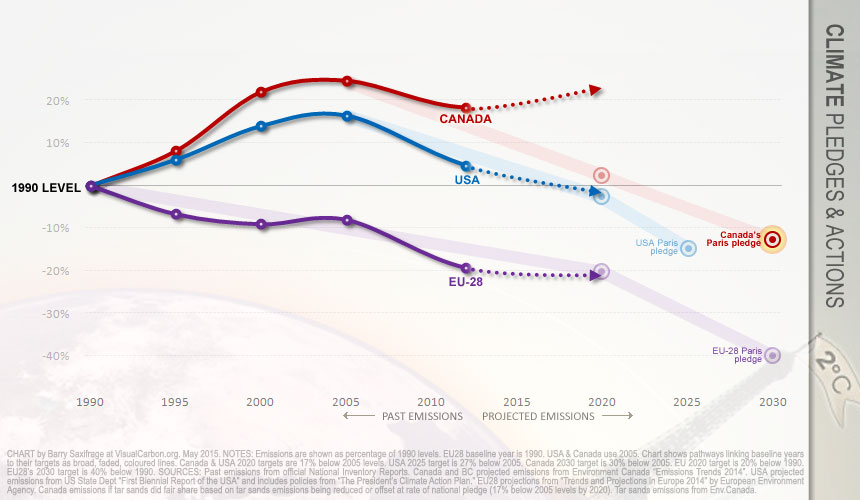
The chart compares the climate pollution and targets of Canada, US and EU-28. Here is the story it tells.
Canada's new 2030 target is shown as a bold red bulls-eye on the far right. Our new pledge of 30 per cent below 2005 is equivalent to 13 per cent below our 1990 emissions.
The good news can be seen in the wide rose-coloured line that marks Canada's climate targets. It shows that our new 2030 target continues the same level of ambition as our previous 2020 target. In fact, our new pledge is slightly stronger:
- Our 2020 Copenhagen target required cuts of 8.3 MtCO2 per year
- Our 2030 Paris target increases cuts a bit to 9.6 MtCO2 per year
The bad news can be seen in how steeply Canada, USA and EU-28 are now promising to cut emissions. Both the Americans and the Europeans have promised much faster cuts after 2020. Canadians didn't.
Why does this matter? The world's best climate science[i] says:
…emission "reductions of 90 per cent or more between 2040 and 2070" are required to avoid the most dangerous impacts of climate change.
If Canada, US and EU stick to their newly pledged rates[ii] they will achieve the needed 90 per cent cut in:
- 2055 for EU-28
- 2057 for USA
- 2078 for Canada
Canadians apparently still aren't aiming for a safe and stable climate.
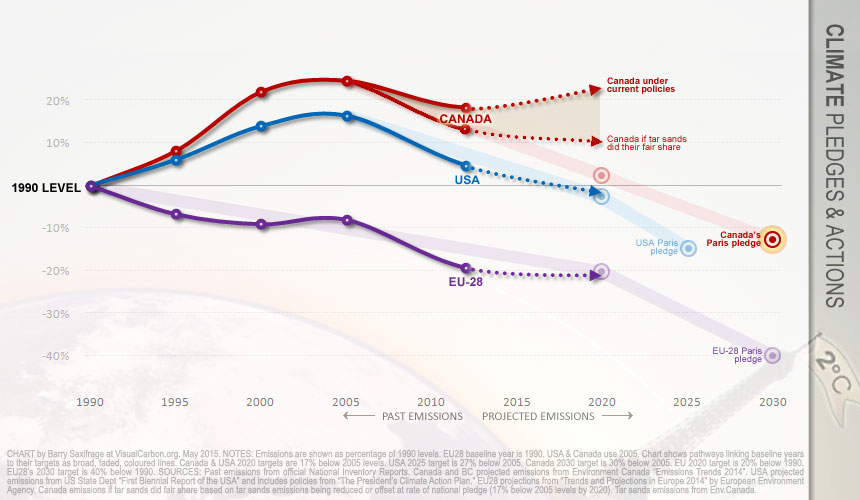
The ugly news can be seen in the dotted red line at the top. This shows where the Canadian government says our emissions are headed without significant new climate policies. Not only will we miss our promises by a mile, but our climate pollution will be heading in the wrong direction. The current gap will quickly become a chasm.
Something big needs to change in Canada.
As discussed in detail in an earlier article, the primary driver of climate failure in Canada is rapidly growing emissions from the tar sands industry. If the tar sands industry instead took responsibility for their excess emissions — by either cutting them or paying others in Canada to cut for them — then Canada would be on back on track now. Even better, both our current and future emissions would be heading down, not up.
Take a look.
Here is the same chart with the addition of a line showing what would happen if the tar sands industry did their fair share with their own emissions.

Notes and sources
[i] International Panel on Climate Change (IPCC) Fifth Assessment report, 2C scenarios.
[ii] Defined here as cutting the same number of MtCO2 each year. On the chart this would show up as a straight line.


Comments