Support strong Canadian climate journalism for 2025
It's a simple recipe. Take one stable climate. Pour in 62,000,000 kilograms of heat-trapping pollution. Repeat every minute of every day. Bake in rising temperatures. Now, after a several decades of pouring in over a trillion tonnes of climate pollution, we find ourselves seriously cooking in 2015.
Just how hot are we getting? Take a look at this impressive list of global all-time-hottest-ever-recorded records that have fallen in just the last twelve months:
- Hottest calendar year ever recorded
- Hottest 12 month period ever recorded
- Hottest December ever recorded
- Hottest February
- Hottest March
- Hottest May
- Hottest June
- Hottest July
- Hottest August
- Hottest September
- Hottest October
- Hottest Northern Hemisphere
- Hottest Southern Hemisphere
- Hottest global ocean temperatures
- Hottest global land temperatures
That's according to the US National Oceanic and Atmospheric Administration's (NOAA) latest report and data. Their temperature records go back to 1880.
This year has been so much hotter than any of those other 135 years that we are now breaking all-time records by all-time unprecedented margins. To illustrate just how hot we've made our planet, here are four graphics made from NOAA's data.
Graphic 1: Hottest Months
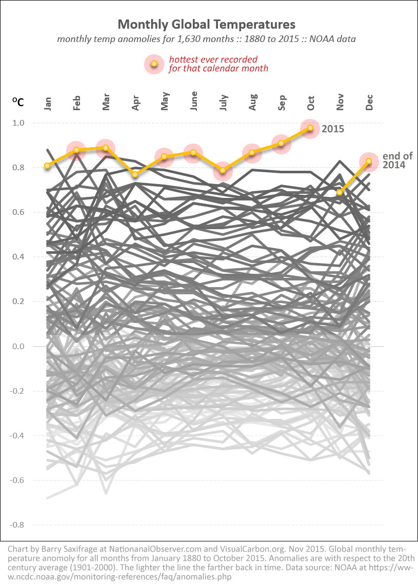
This first chart shows every month since 1880. That's 1,630 months.
Amazingly, the hottest February, March, May, June, July, August, September, October and December ever recorded all occurred in the last twelve months (orange line).
And this September was so abnormally hot that it shattered the old record by the biggest margin ever recorded for any month of any year. It was a biggest single leap into a hotter world in at least 135 years.
And then October came along and just blew that mark out of the water.
The chart also illustrates the steady rise in global warming. Because years are drawn progressively darker from 1880 to 2014, you can see the pattern of increasing temperatures as the years go by.
CHART: Global monthly temperate anomalies from January 1880 to October 2015. Last 12 months are shown in orange. Red circles show all-time records. Lighter lines are farther in the past. Data: NOAA. Chart by Barry Saxifrage at NationalObserver.com and VisualCarbon.org
Graphic 2: Hottest Year
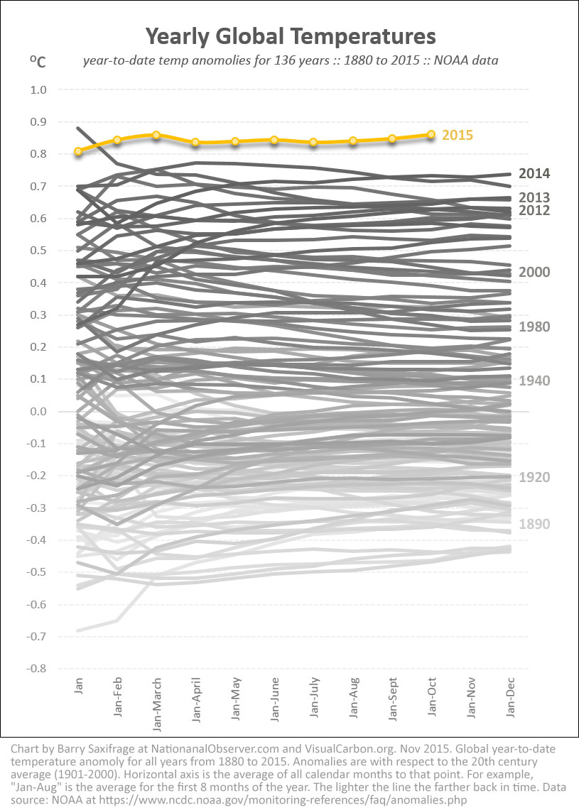
That amazing string of hottest months has set up 2015 to be the planet's hottest year ever recorded.
My second chart shows just how hot this year is compared to each of the last 136 years.
In this chart the lines show the year-to-date average of all months up to that point. For example, the third column, "Jan-March", shows the average of the first three months. That means the "Jan-Dec" finish line shows how hot the entire year was compared to every other.
As you can see at the top of the chart, 2014 just broke the record for the hottest calendar year. It jumped into record hot territory by a comparatively large margin.
But now 2015 is so much hotter than that, it's as if we are living on a different planet all together.
CHART: Global year-to-date temperate anomalies from 1880 to 2015. Lines show running average of all months in the year up to that point. Lighter lines are farther in the past. Data: NOAA. Chart by Barry Saxifrage at NationalObserver.com and VisualCarbon.orgGraphic 3: Hottest Land, Oceans and Hemispheres
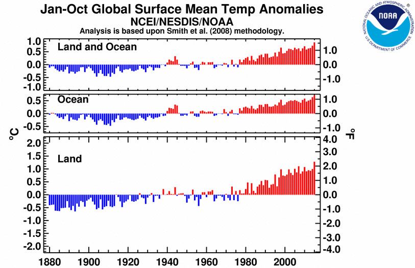
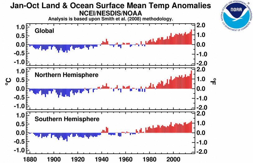
To illustrate the remaining four global heat records— hottest oceans, land and two hemispheres— here are NOAA's own charts:
Charts courtesy of NOAA State of the Climate: Global Analysis for October 2015. http://www.ncdc.noaa.gov/sotc/global/201510


Graphic 4: 2015 hottest vs coldest
One of the basic predictions of climate science is that as we heat up the climate, more regions will break all-time heat records and fewer will set cold records. Climate scientist Dr. James Hansen describes it as our climate pollution loading the "climate dice" to roll ever hotter temperatures.
This imbalance in hottest vs coldest can be seen clearly in the temperature maps produced by NOAA. For example, below is NOAA's latest temperature map for 2015. I slightly modified it by highlighting the record warmest and record coldest regions, while fading out the rest.
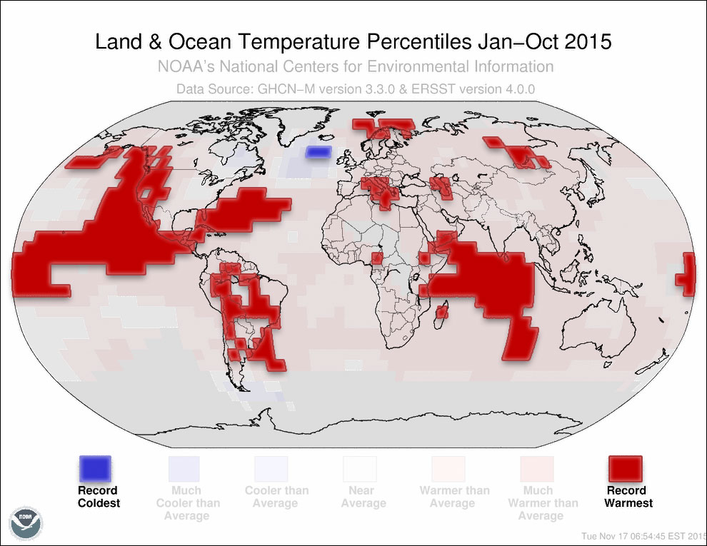
As you can see, large regions of our planet have been all-time record warm this year. All that extra heat has fuelled record-breaking hurricanes, drought, flooding, coral bleaching and other turbo-charged weather extremes.
In contrast, just one small region of the globe, near Greenland, has been record cold this year. Even that cold spot, some scientists think, could be the result of global warming. Measurements show that a massive Atlantic current that pumps heat towards northern Europe is slowing down (pdf). The cause of this slow down might be the growing surge of fresh water running off Greenland's rapidly melting ice cap.
The geeky details: the role of El Nino
For those readers that like the nitty gritty of climate data, I'll close with a look at the global warming role of El Nino vs climate pollution.
This year the Pacific Ocean is experiencing a strong warm phase of the El Nino Southern Oscillation (ENSO). ENSO's warm phase— commonly called just "El Nino"— tends to temporarily increase global temperatures.
However, this temperature boost is soon balanced out by ENSO's cold phase, often called "La Nina". The net result, according to multiple studies, is that ENSO has very little long-term impact on global temperatures.
Instead, the primary driver of long-term global warming is our fossil fuel pollution. Our accumulated climate pollution is now trapping an additional 400,000 atomic bombs worth of energy into our climate every day. Without this CO2-driven global warming, years with a strong El Nino, like this year, would be much cooler.
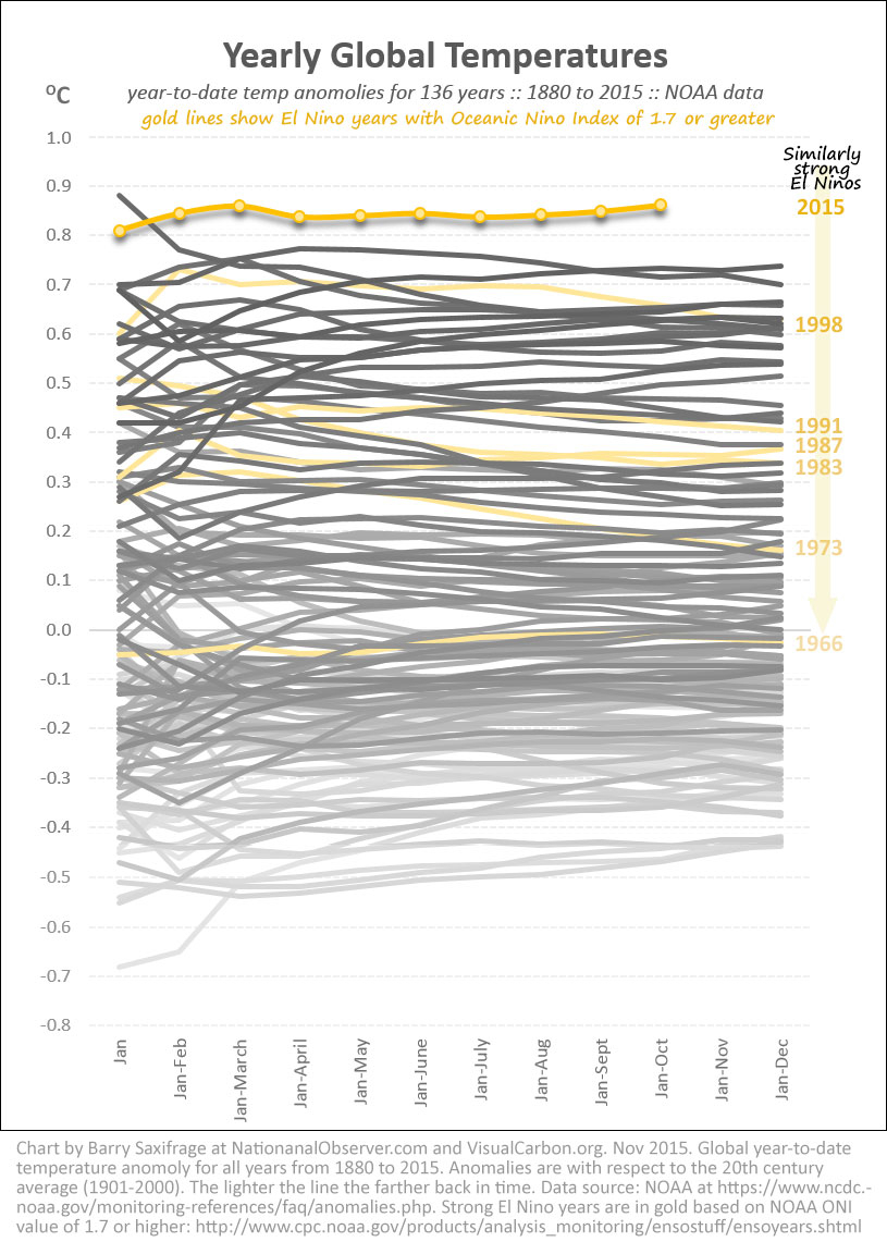
To help illustrate this, I highlighted strong El Nino years in my yearly temperature chart. All the temperature records set so far this year happened when our current El Nino was rated at 1.7 or below on NOAA's official Oceanic Nino Index (ONI). So for comparison I included every El Nino in the last half century with a value of 1.7 or higher.
The resulting chart shows clearly that years with similar strength El Nino events have ended up with very different temperatures as the decades role on.
El Ninos with a similar strength as this year—which happened back in the 1960s and 1970s, for example— resulted in far cooler global temperatures than today.
As the studies have shown, ENSO acts like a temperature yo-yo that doesn't change how hot the planet gets over time. It is our fossil fuel CO2 that does that. It is the primary "control knob" of our climate and it is what is causing us all to bake in such record heat.
CHART: Global year-to-date temperate anomalies from 1880 to 2015. Lines show running average of all months in the year up to that point. Lighter lines are farther in the past. Gold lines are El Nino years with an ONI value of 1.7 or higher. Data: NOAA. Chart by Barry Saxifrage at NationalObserver.com and VisualCarbon.org


Comments