Support strong Canadian climate journalism for 2025
To address the twin threats of climate change and ocean acidification, nearly every nation has promised to reduce fossil fuel burning.
But so far, humanity keeps burning ever more. Last year we did it again, burning an all-time record amount.
That's according to data compiled from the latest "BP Statistical Review of World Energy." This annual report is one of the most widely used and referenced around the world. It's big and comprehensive with fifty pages, thirty-three spreadsheets and forty charts. The report highlights most of the important trends in global energy. Most. But one critical trend was nowhere to be found....
Conspicuously absent was the basic statistic on fossil fuels that I, as a climate reporter, was looking for: how much fuel is the world burning each year? Such a simple question, and the answer tells one of the most important stories in the world: are we finally turning the corner on our fossil fuel dependency?
To find that missing story, I needed to download and combine multiple BP data sheets, do the math, and then build my own charts to reveal the trends. Here (drumroll, please) are the "missing charts" and what they have to say to us…
The missing charts: how much carbon-polluting fuel is humanity burning?
I built three charts using the compiled BP fossil fuel data. This first chart shows the total energy consumed from burning fossil fuels each year.
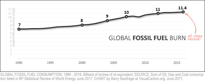
As you can see, the amount we burn continues to rise. Last year humanity set another fossil fuel energy record of 11.4 billion tonnes of oil equivalent (Gtoe). A decade ago we were at 10 Gtoe of energy. In 2000, we were at 8 Gtoe.
There is certainly no sign in this chart of a turning point in our relationship to fossil fuels.
My next chart uses the same BP data, but this time shows the annual increase from year to year:
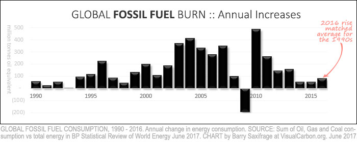
In 25 of the last 26 years, we burned more fossil fuels than the year before.
The only year in the last quarter century with a decrease was 2009. That was caused by a sharp global recession. And within a year, that rare respite was wiped out by a massive surge that followed.
Sadly, there is no sign of a turning point in this chart either.
Take last year for example. The increase wasn't particularly large, but it wasn't particularly small either. In fact, it was right in line with the 1990s average. And the nineties certainly weren't anyone's idea of a retreat from burning fossil fuels. Nor were they a turning point in our fight against climate change or ocean acidification. The 1990s were business-as-usual.
Finally, here's a third view of the same BP data. This one illustrates fossil fuels' share of all global energy. Turning point?
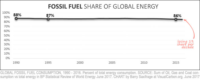
What this chart says to me is that fossil fuels continue to absolutely dominate global energy consumption. Even a quarter century of global efforts to transition to safer energy sources was unable to make any meaningful dent in the dominance of fossil fuels.
Together, these three "missing" charts of BP's fossil fuel data — ever rising amounts; increasing every year; and maintaining uncontested dominance — paint a sobering picture of humanity's lackluster response to the growing threat.
As California Governor Jerry Brown lamented in a recent New York Times interview: "No nation or state is doing what they should be doing. This is damn serious, and most people are taking it far too lightly than the reality of the threat. You can’t do too much to sound the alarm because so far the response is not adequate to the challenge."
Those three missing charts illustrate our inadequate response quite clearly. Perhaps that is why BP (an oil & gas company after all) left them out of their report.
Oil, gas and coal: the last five years
I started digging into the BP data because I've read a fair number of articles proclaiming that a fundamental shift in fossil fuel use is underway, and I wanted to see it for myself. Unable to find any sign of it in the aggregated fossil fuel data shown above, I decided to drill down into oil, gas and coal separately.
If we really are at a turning point in our use of fossil fuels then we should be able to find some sign of it in BP's oil, gas and coal data for last five years. So, let's take a look at each of those.
I'll start with the biggest of all: oil.
Fossil oil dependency rockets upwards
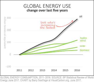
My chart on the right shows the increase in global energy use over the last five years. Renewables are in green and oil is in black.
Notice any turning point?
To make matters worse from a climate perspective, an analysis by ARC Energy Institute shows that the oil-efficiency of the global economy has also been getting significantly worse in recent years. In other words, humanity has reversed course and is now burning more oil per dollar of GDP with each passing year.
They conclude: "Headlines around electric cars and carbon policy suggest our oil dependency is on a slippery downward slope. Recent data from 2016 suggests the opposite: our worldwide addiction is getting stronger."
With no sign yet of a turning point in oil burning, let's look at fossil gas.
Surging fossil gas is locking in climate failure
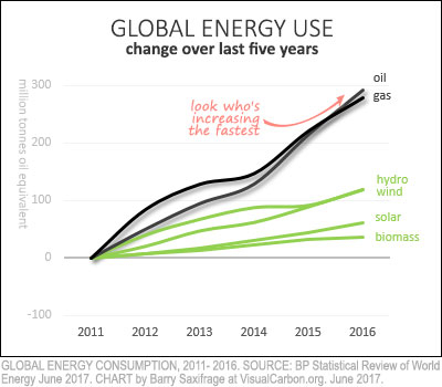
I added natural gas to my chart and...ouch. It seems that the recent increase in natural gas burning has nearly matched oil's blistering pace.
Indeed, we have increased use of fossil gas far more than we have for the climate hope twins — wind and solar — combined.
As Bloomberg New Energy Finance sums it up, the "outlook on natural gas is brighter than ever." BP, Exxon Mobil, Shell and the International Energy Agency (IEA) have all published reports that agree. Each one projects fossil gas consumption will keep growing far into our future.
That's certainly bad news for our destabilized climate and oceans. The title of a new report from Climate Action Tracker highlights the risk: "Foot off the gas: increased reliance on natural gas in the power sector risks an emissions lock-in."
Their analysis shows that surging investment in fossil gas infrastructure and production is enough to ensure failure for the Paris Agreement on climate change.
With oil and gas use sprinting rapidly towards climate failure, let's turn to our attention to the remaining fossil fuel: coal.
At least coal is falling. Or is it?
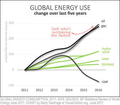
Adding BP's coal data to the chart finally gives us a glimmer of climate hope in the bad news. It looks like coal burning has declined in the last few years.
Or has it? Could those coal numbers be wrong?
Sadly, the more I drilled into them, the more likely it seems that the numbers are under-reporting what's really being burned.
Here are four maddeningly compelling reasons to be skeptical of a coal downturn:
- Data: Our atmosphere shows no sign of it.
- History: China has huge under-reporting problems.
- Human nature: Growing pressure to under-report and no way to catch it.
- Money: New coal plant construction is booming worldwide.
Let's look at each in turn.
Reason #1: Our atmosphere shows no sign of it
BP says that the reported decline in coal burning means that global CO2 emissions have stopped rising. If so, then someone forgot to tell our atmosphere about it.
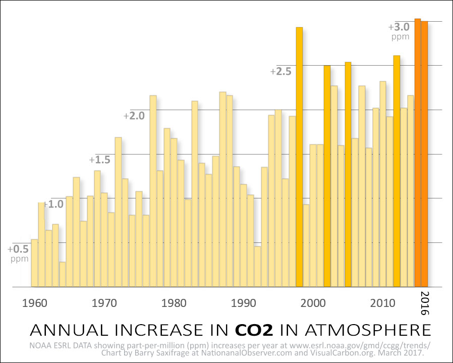
Instead, CO2 levels in the air have been surging upwards at record-breaking rates.
Here's a chart showing the CO2 increase each year since 1960. Those two tallest orange bars on the right show that CO2 rose by all-time record amounts in each of the last two years.
(See related article: Atmospheric CO2 levels accelerate upwards, smashing records)
Not only is there is no sign of a turning point in our atmosphere, but CO2 levels are actually accelerating upwards. My next chart shows this clearly:
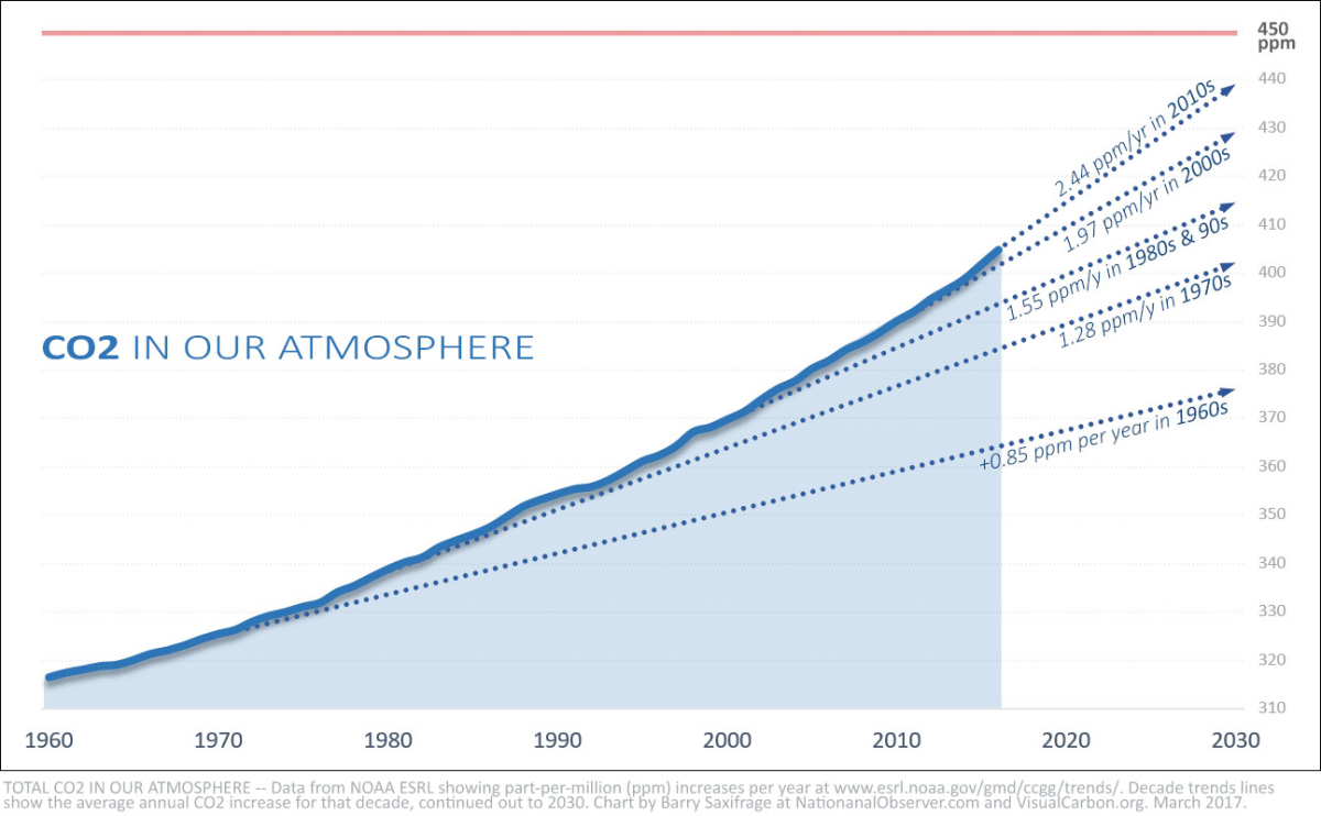
Scientists are able to measure the levels of CO2 in our atmosphere very accurately. Atmospheric CO2 data doesn’t rely on unverifiable, self-interested, reports from industries and nations — like BP's coal statistics do.
Now, it could be that the huge mismatch between our atmosphere and the claims of coal burners is the result of nature behaving in some new way we don't understand.
On the other hand, it could be the result of humans acting in familiar ways that we do understand: by under-reporting.
Reason #2: China's problem with under-reporting emissions
China burns half the world's coal. And China also struggles to accurately measure and report its emissions.
How inaccurate are China's numbers?
The New York Times recently reported that China's "pollution and energy data can be unreliable or outright fake."
Widespread accounting problems have become a major issue threatening the roll out of China's new national carbon market. In other words, they don't trust their energy accounting enough to rely on it themselves.
An eye-watering example of one of China's past accounting errors happened just a few years ago. The government revised its 2013 coal estimates upwards by 600 million tonnes per year. Yeah, that's a lot.
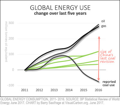
To put that into perspective, I've added this amount to my chart as a red arrow. As you can see, it's double the entire reported global coal decline from the last three years.
Oh, and before that 2013 revision, China had another gigantic one.
A decade earlier, another big error in China's coal reporting "created an erroneous impression that China had succeeded in generating economic growth without increasing emissions." Instead, their coal data was under-reported.
So, are China's more recent coal estimates also too low? Unfortunately it will be a few more years before we find out because China only reports revisions every five years.
If their numbers are off by a sizable amount again, it could instantly erase the supposed global "downturn" in coal. That would bring reported global fossil fuel emissions more in line with what scientists are measuring in our atmosphere.
China is certainly not the only nation with inaccurate coal numbers. India and others struggle with this too. Partly it is caused by developing nations' lack of resources. Partly it is caused by the growing pressure to under-report the numbers, as we will see next.…
Reason #3: Growing pressure to under-report and no way to catch it
As the impacts of climate change and air pollution continue to grow worse, pressure is growing on foot-dragging governments and industries to fudge their numbers so they appear to be acting more vigorously than they really are.
This is true around the world, not just in China. For example, the metastasizing Volkswagen emissions cheating scandal revealed a widespread, intentional effort to under-report emissions on a global scale. And that cheating occurred in a highly-regulated industry with required verification tests.
Caixin reports on another recent example from China: "Recent Environmental Ministry inspections found that one-third of manufacturers in northern China had tampered with emissions data to avoid heavy penalties." There is now a "cottage industry" to help fake the numbers. That cheating also took place in a regulated industry that required verification tests.
Now consider coal burning. Pressure is growing to cut back because of toxic air pollution, the Paris Agreement promises, worsening climate change and the emerging ocean acidification crisis. Also consider that, unlike those other examples of cheating, there is no way to verify coal burning claims.
Scientific American warns that the "world needs a way to verify that nations have made their promised carbon cuts … The current inability to verify that a nation has made its promised carbon cuts remains a long-standing loophole that experts say must be closed to make the global pact (Paris Agreement) effective."
The New York Times reported on verification in China: "Like some other nations, China, the world’s biggest polluter, has refused to accept international monitoring of its emissions and says it will provide data to outside observers. In the past, conflicting data about the country’s energy use has raised questions about accuracy...Furthermore, there are persistent differences between coal consumption statistics reported on the provincial and national levels."
Widespread emissions cheating is occurring even in highly regulated areas with mandatory verification testing. It is even more tempting to under-report coal burning numbers because they are mostly self-reported and there is no way for others to disprove the claims.
Reason #4: The global boom in new coal plants
A final reason to be skeptical of a coal downturn is the boom in coal plant construction worldwide.
If humanity is really at a turning point for coal then why are investors pouring hundreds of billions of dollars into increasing global coal power capacity by 43 per cent?
That depressing statistic comes from the coal-tracking database compiled by the German group, urgewald. A recent article in The New York Times makes for sobering reading and leaves little doubt about the scale and breadth of the ongoing coal expansion. This global coal boom is being led by Chinese companies, but they aren't limiting their efforts to China. Nations with no history of coal burning are about to join the club for the first time.
This mismatch between climate promises to reduce fossil fuels and the financing being injected into fossil fuels is happening all around the world.
A new joint report led by Oil Change International, "Talk is Cheap: How G20 Governments Are Financing Climate Disaster," adds it all up. "Of all public finance for energy provided by G20 institutions and the multilateral development banks between 2013 and 2015...58 percent supported fossil fuel production."
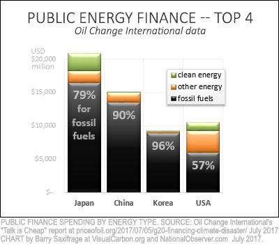
I created the chart on the right from that report's data. It shows the top four nations in public financing of fossil fuels between 2013 and 2015.
Every one of them poured far more money into fossil fuels than into all other energy sources combined.
And just look at China. A whopping 90 per cent of government energy spending went to fossil fuels. The "Talk is Cheap" report says China spent more on coal than on all non-fossil energy sources combined. Downturn?
Even under former U.S. president Barack Obama, a major proponent of climate action, the United States spent more public money on fossil fuels than on all alternatives combined.
Fossil fuels vs climate hope
It's hard for me to see any sign of good news for our future climate or oceans in BP's latest energy data. There is no sign of a turning point in our dependence on fossil fuels. Here again is the first of the "missing charts" that shows so clearly our ever-upward demand for fossil fuels.

Even at the relative level, the burning of fossil fuels continues to overwhelmingly dominate global energy consumption. Decades of efforts to shift to safer sources have barely dented fossil fuels' share, which continues to float north of 85 per cent.
When we drill down to recent trends in oil and gas it's even more discouraging. The burning of both those fossil carbon fuels continues to surge dizzyingly upwards, out-running the safer alternatives. Reports show that these twin surges threaten to "lock in" global climate failure.
The one possible point of hope for our climate and oceans is in the data on recent coal burning. But this data is the most likely to be under-reported. Coal burning has been spectacularly under-reported in the past. Repeatedly. And now, as pressure grows, more and more nations and industries stand to benefit by under-reporting. They face little chance of being caught if they do. That's because the world lacks any way to verify much of the global coal reporting.
Meanwhile, construction of coal plants continues to boom around the globe and CO2 levels in our atmosphere continue to accelerate upwards.
If we want hospitable climate and oceans, the fossil fuel data suggests that our efforts so far are far too little. In the words of California Governor Jerry Brown, "You can’t do too much to sound the alarm because so far the response is not adequate to the challenge."



Comments
Excellent, disgusting, disheartening, changeable.
Thanks for this article. Before I read this, I had thought that coal use was down, and that this was a bright spot in our move to mitigate climate change. But you have convinced me that it is not necessarily the case, as the level of carbon dioxide in the atmosphere continues to grow, and that there is a boom in the number of new coal plants, and there is a good probability of under-reporting of coal emissions. This article was really well researched and written, and has important implications for the level of action needed to really mitigate emissions.
Data I looked at in the early 2003 suggested that we were burning through 2,500,000 years of global solar capture (in plants) worth of fossil fuels in the mid-1990's. How can this be sustainable? Cognitive scientists have confirmed that we humans are largely unable to understand (aka believe emotionally) exponential processes aka positive feedback. Lemmings at the edge? or already over the lip?
Why aren't we all switching to EVs immediately?
In Canada its because the government subsidizes the fossil fuel industry rather than supporting EV's. No subsidies to manufactures or to buyers. Ontario has cut rebates to EV buyers. Also no infrastructure to support EV's. Gas stations at every corner in most cities but nary an outlet to charge a car at parking lots etc. =(
Also not accounted in annual report on GHG emissions from countries like Canada and Russia which are covered by the largest forest area in the world, the boreal forest, are emissions from "natural disturbances" (e.g. forest fires, insect pest outbreaks, melting of permafrost, drought, soil degradation, disease, etc). Wildfires and human-caused forest fires around the world have been increasing dramatically over the years. In Canada, an average of 9,000 fires burn more than 2 million hectares of forest each year (in 2014, a total of 5,126 forest fires burned about 4.6 million ha). According to scientists at Natural Resources Canada's Canadian Forest Service, this is twice the average area burned in the early 1970's. Various modelling scenarios predict another doubling or more by the end of the century, because of warmer temperatures expected as a result of climate change.
Peatland ecosystems cover 2%-3% of the earth's land surface, but 25%-30% of the boreal forest region. It is estimated that they store 30% of the world's terrestrial carbon, but about 64% of the estimated total global boreal forest carbon stock. These carbon reservoirs are likely to become increasingly vulnerable to fire as climate warming progresses.
(source: NRC (2013-12-04): "Peatlands fires and carbon emissions")
Over the years Canada's forests have become a net "source" of carbon, emitting more and more carbon into the atmosphere. As forests have become a "source" of carbon instead of a "sink", the federal government has decided not to include "natural disturbances" in its GHG emissions account in the LULUCF sector. It has even said in its 2016 "Second Biennial Report submission to the UNFCCC" (section 5.1 footnote): " Canada has indicated that its accounting for managed forests towards its emissions reductions target will exclude the impacts of natural disturbances because these impacts are non-anthropogenic".
Contrary to all the scientific research, private and governmental, the Trudeau government is saying that climate change, resulting from human activities, has nothing to do with the wildfires and insect infestations affecting Canadian forests.
Trudeau's government policy of pipeline expansion and growing fossil fuel production (still subsidized) will make it harder for Canada to reach its GHG emissions reductions target. Playing down emissions by making them disappeared from official reports won't change the fact that Canada will never reach its intended targets. In the meantime, people in western Canada have to deal with major forest fires that are destroying their livelihood and their environment.
(a must read: NRC Research Press, October 09, 2013: "Anticipating the consequences of climate change for Canada's boreal forest ecosystems")