Support strong Canadian climate journalism for 2025
Three of humanity's greatest crises are caused by fossil fuel pollution: climate chaos, ocean acidification and the deadly smog choking cities worldwide.
The solution to all three requires we eliminate fossil fuel burning and "electrify everything" instead. Why? Because all the world's climate-safe energy sources of any significant scale produce electricity. As White House national climate adviser Gina McCarthy recently explained to Bloomberg: "Everything eventually has to be electrified."
The choice we have today is to plug in or burn.
Canada, however, is still racing away from climate safety. Instead of "electrify everything," we are de-electrifying as we crank up fossil fuel burning. We're increasing our dependence on the very fuels causing our metastasizing crises.
Here's a chart-filled tour of Canada's past energy trends and where we stand now in the climate-required energy transition to "electrify everything."
Fossil versus electricity in Canada
My first chart shows Canadian energy use over the last two decades, in terawatt-hours per year (TWh). The data for all my charts in this article come from National Resource Canada's Energy Use Data Handbook, which covers 2000 to 2018.
Cranking the burn 10 times faster
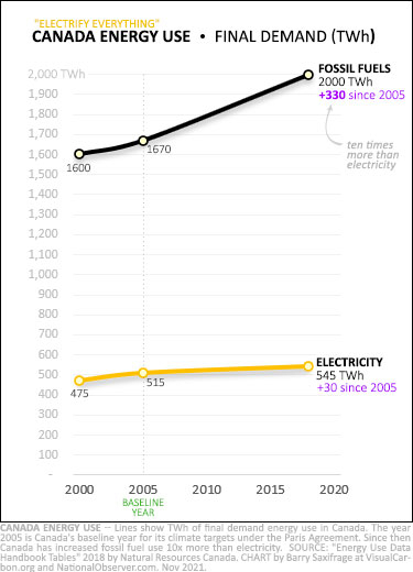
As the upper black line shows, Canada's fossil fuel burning has been rocketing up — not falling rapidly as required for a safe future. It's risen 330 TWh since 2005. That's Canada's baseline year for our Paris Agreement targets.
The bottom orange line shows our electricity use rose only 30 TWh.
That means we've increased fossil burning 10 times more than electricity use since the start of our climate target.
Not only are we failing to "electrify everything," but even more discouragingly, we've been actively de-electrifying our economy.
De-electrifying Canada
My next chart shows the same energy data, but this time as percentages of our energy use.
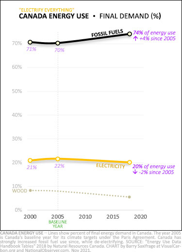
The black line now shows clearly that we've been increasing our fossil fuel burning even faster than our overall energy use. That's pushed Canada's fossil fuel dependency up from 70 per cent of energy use in 2005 to 74 per cent now. #BurnItAllCanada.
And we've been doing the opposite with electricity. Despite having some of the climate-safest electricity in the world, Canadians have been reducing their reliance on it. In 2005, we used electricity for 22 per cent of our energy. Now it's down to its lowest point in decades, at only 20 per cent. #deElectrifyCanada.
(Energy note: The handbook's data covers "final demand." That's the point when Canadians decide whether to use electricity or to burn fossil fuels instead. "Final demand" data excludes the fossil fuels used to create our electricity. When these are included, fossil fuel's share rises to 78 per cent of Canada's total energy use.)
What this government data shows is that by prioritizing fossil burning, Canada has squandered decades. And we're still heading recklessly in the wrong direction. Unfortunately, our destabilizing climate isn't waiting around for us to get our act together. It's unleashing a Pandora's Box of miseries that will grow ever more dangerous until climate pollution falls to zero.
The transition required to avoid a full-blown climate crisis was always going to be a gigantic task. We really need to stop making it so much harder for ourselves and get to work while we still have a shot at it.
So now what?
To try to provide a visual overview of where we are now in Canada, and the task ahead of us, I created the "Electrify Everything" chart below. This is my personal cheat sheet for our energy transition. I keep a copy handy to help separate out the greenwash and hype from actual climate progress.
Here's what it shows.
‘Electrify Everything’: Where we are now
My "Electrify Everything" chart covers all Canadian energy use, broken down by sector.
At the top is Canada's transportation sector. It's at the top because it emits the most climate pollution — around 200 million tonnes of CO2 per year (MtCO2). Climate pollution is the reason we need to make this energy transition. And the chart emphasizes the importance of this by stretching the height of each sector's box to match its emissions.
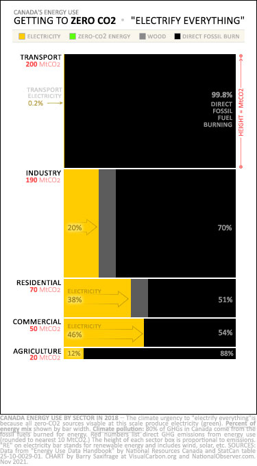
The transport sector is also Canada's least electrified — at a fraction of one per cent. The chart shows electricity as orange bars. The one for transport is so tiny, it is almost invisible.
This is Canada's deepest climate hole and one that we keep digging deeper. Canadians are buying the world's most climate-polluting cars and trucks, and emissions are soaring unchecked. (The next article in this series focuses on this sector.)
Our next biggest climate polluter is our industry sector — emitting 190 MtCO2 per year from energy use. Fossil burning again dominates (black bar). Just 20 per cent of its energy comes from electricity today.
The buildings in our residential and commercial sectors are the furthest along in Canada's "electrify everything" transition. The good news is millions of Canadian buildings are already all-electric and have been for decades. I live in one. I'm sure many of you do as well.
The bad news is that despite zero-emissions buildings being common and critical to the climate fight, most Canadians continue to burn fossil fuels in their buildings. In fact, fossil methane (a.k.a. "natural gas") burning is the primary energy source in both our homes and commercial buildings. And its use continues to rise. (The third article in this series looks at the residential building sector.)
The bottom sector on the chart is agriculture. With just 12 per cent of its energy coming from electricity, our food growing sector is one of the furthest behind in the required energy transition.
To be clear, the 20 MtCO2 listed for agriculture is only the climate pollution from its energy use. It doesn't include the additional emissions from land use — such as tilling and cattle methane. Our food growing industry has lots of climate work ahead of it in addition to its huge electrification task.
There is one more sector not on the chart yet — electricity generation.
Generating climate-safe electricity
The "electrify everything" transition has two parts.
The first, discussed above, is to electrify all sectors. The second part, discussed below, is to make sure all electricity gets generated from zero-emitting, climate-safe sources.
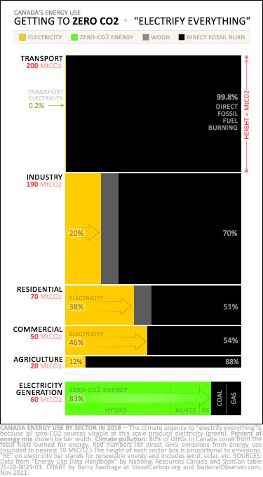
To show how Canada is doing on this second part, I've added the electricity generation sector to the chart.
It’s at the bottom with the wide green bar.
Green indicates zero-CO2 energy sources. In Canada today, these include hydropower, nuclear and a growing whack of renewables like wind and solar.
Note all the green on this chart is in electricity generation. That visually illustrates why we need to "electrify everything" — because electricity carries all our climate-safe energy.
Fortunately, 83 per cent of Canadian-made electricity currently comes from zero-emitting, climate-safe sources.
The remaining 17 per cent comes from burning coal and fossil methane. Canada has policies on the books to phase out the remaining coal-fired generation.
Much of our coal-fired power has already been shut down in Canada. That has cut emissions from electricity generation in half since 2000. It's down to 60 MtCO2 per year and falling fast.
Cleaning up our electricity has been Canada's only real climate success so far. Now we need to get to work on the first part of the climate task as well — powering our economy and lives with our Canadian-made electricity instead of fossil fuels.
What about future fuels that are also climate-safe?
I read a lot in the media about futuristic zero-CO2 fuels that might be used instead of electricity — like hydrogen made with renewable energy ("green hydrogen"), or air fuels.
Unfortunately, none of these exist at quantities large enough to even show up on this chart, much less being a major energy source. It takes decades to scale up any new energy source from scratch and bring its price down enough to be broadly competitive with the renewables we already have. So far, all these future zero-CO2 fuels are very expensive and exist in tiny experimental amounts.
Worst climate record in the G7
Canada's decades of foot-dragging and fossil-lovefesting have left us high up the climate cliff. Now, as the metastasizing climate crisis starts to hammer away in earnest, we're increasingly exposed and ever further from safety.
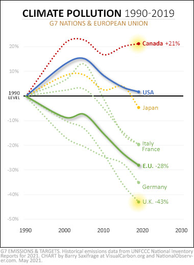
Our energy transition now needs to happen quickly and at a massive scale. Fossil fuel burning needs to start declining — across all our sectors. And the only safe energy option we have is to "electrify everything."
Our failure to rein in our fossil fuel burning has left us with the worst climate record in the G7 — by far.
The G7 is the world's largest advanced economies. They hold more than half the world's wealth, produce half the global GDP, and emit a third of the climate pollution. These are the nations with the talent, technology, and funds available to lead the way on climate solutions.
If Canada can't find a way to cut our emissions with all our resources and talent, how can poorer nations with far less ability to act do it? They can't.
Preventing a full-blown climate crisis requires real climate leadership from Canada. You know, the kind that actually reduces our fossil burning and that gets to work "electrifying everything" — both in our nation and in the nations around the world that desperately need our help.
----------------------
Next up: This national overview was the first part of a three-part series on "Electrify Everything" in Canada. My next article will take a closer look at Canada's least electrified sector, transportation. And my final article will look at one of our most electrified sectors: residential buildings.
----------------------
Geeky endnotes
(1) About burning wood.
Canadians burn wood for about six per cent of final energy use. This was shown in the chart on energy use as a dotted grey line. And it's also shown in my "Electrify Everything" chart as grey boxes. This is mostly wood waste from mills, pulp from paper-making, and firewood for home heating. Overall, wood-burning has declined by a fifth since 2005.
Some people categorize burning wood as climate-neutral on the theory that forests regrow and thus reabsorb the CO2 released. However, Canada's official greenhouse gas inventory shows our managed forests are now carbon emitters, even before accounting for harvested wood. So, the CO2 from burning harvested wood isn't getting reabsorbed. It's ending up in the atmosphere just like fossil fuel CO2. In addition, burning wood emits more CO2 per unit of heat than coal.
Nobody knows when, or even if, Canada's managed forests will return to carbon sinks. With global warming happening twice as fast in our northern forests, all bets are off. So, until there is clear and solid science showing our managed forests have rebuilt their own lost carbon stores and are absorbing enough extra CO2 to replace logged carbon, I for one, won't be listing harvested wood as zero-CO2 or climate-safe.
(2) A more detailed chart with sub-sectors.
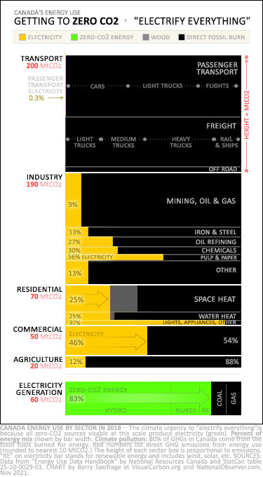
For those energy and climate nerds out there who are interested in a more detailed "electrify everything" chart, here's a version that includes the sub-sectors for transport, industry and residential buildings.
The height of each sub-sector indicates its relative emissions from energy use.
In the transport sub-sectors, I've also shown the percentage of energy used by each mode. For example, in the passenger sub-sector, the dots indicate that "cars" burn 34 per cent of the fossil fuels, "light trucks" burn 40 per cent and flights burn 22 per cent. The remainder, which is too small to label on the chart, is burned by buses, trains, ships, etc.
(3) How I use this chart.
I keep this chart handy as my personal reference for putting any climate claim, policy, or stat into perspective. Here's how I use it.
I first check if the proposed action or policy would expand the green (zero-emitting) or orange (electricity) on this chart. Everything must become one of these colours.
If it isn't green or orange, then it won't be one of the zero-CO2 solutions that we need.
But if it is one of those two colours, then I next try to determine how big of a bar it will be on the chart.
We certainly need all solutions, big and small. That's the "silver buckshot" reality of the task. But we also can't afford to be lulled into inaction by hype and greenwash. When small steps get trumpeted as huge solutions, they serve as pressure-relief valves that defuse the urgency to do more. So, we need better clarity and perspective around proposed "solutions." This chart helps me do that.
Here's one example. Let's say I'm reading about a proposal to use LNG for freight trains. I pull out my chart and ask if it will add green or orange to it? Nope. So, it's not the end solution we need. What about a proposal to power trains with electricity or renewable-energy hydrogen? Those would expand the orange or green on the chart. So, then my next question is by how much? My chart shows the energy used by "rail & ships". So, that lets me visualize what a best-case scenario would look like if all the fossil fuel used for this task all across Canada got replaced. It is helpful to me to know the maximum possible potential. As a final step, I mentally scale down that best-case scenario to whatever percentage this proposed energy solution seems likely to fill.
I created an initial version of this chart last year for my own use. I was frustrated that nearly all the climate and energy articles I read lacked a big picture context for how they fit into our required energy transition. Without this context, I found it hard to keep from being swept along by the king tides of greenwash and hype that are flooding our media and political climate discussions. I kept having to dig into one spreadsheet or another to try to get some perspective. I finally took the time to create this all-at-a-glance summary of Canada's energy use.
It has proven so helpful to me that I decided to spiff it up and write this series of articles around it. Hopefully, some other climate and energy nerds out there will find it as useful as I have.


Comments
Another excellent article. Your observation that only 20% of our primary energy consumption comes from electricity applies to almost all industrialized economies, and to global energy consumption as well. This serves to illustrate the scale of the decarbonization challenge, but it is important to recognize that this does not mean that we need to scale up electricity production by a factor of 5. Most of the natural gas used by the residential sector in Canada is used for low temperature space heating for example. Replacing natural gas furnaces by state-of-the art electric heat pumps would reduce energy consumption by a factor of at least 2 for air-source heat pumps and 3-4 for ground source, assuming no change in building heat loss by improving insulation, etc. Similarly, a Tesla Model 3 is at least 4x as energy efficient as an equivalent gas powered car and 2-3x as efficient as a hybrid, basically because electric motors are much more efficient than any type of internal combustion engine.
Electricity and combustible fuels should not be compared strictly on an energy basis. Electricity is thermodynamically almost the highest grade form of energy, work
Good, solid stuff.
Have you tried to put solar cells on your roof? To a large extent our legacy power system based upon franchise areas discourages distributed generation and storage. Further, legacy central generation is currently favoured as it provides guaranteed returns to institutional and other large capital investors.
Great stuff
The secret super power of most electric technologies (EVs , heat pumps) is that they are highly energy efficient. Measuring by TWh won’t give us full picture of actual energy services provided. That’s hard to find in national stats, but could get a picture of it in some sectors by counting # of vehicles, primary heating systems etc. rather than PJ / TWh. I will also note that energy saving programs and strategies more robust in electricity than fossil fuel sector, there are jurisdictions like Nova Scotia or BC seeing level or even reduced electric load growth, but seeing more electric energy services with energy savings making up the difference.
The problem, of course, is people. Darn those guys.
We install windfarms as fast as they can go up, improve engine efficiency for both cars and planes...and people's free choices for bigger vehicles and more speed undermine everything.
The internal combustion engine has become 30% more efficient since the Arab Oil Crisis of the early 70s pushed for it. How did everybody respond? They switched from cars and station wagons to vans and SUVs.
Greyhound went out of business because nobody wanted to save carbon, enough, to spend a day (or four) on a bus rather than a few hours in airports and planes.
Environmental activists cheered Greta Thunberg for not taking a flight across the ocean. But instead of taking rooms on cargo ships that were crossing anyway (not easy to book, but possible, with enough warning), or getting together to rent a sailboat, hundreds of activists FLEW to COP26, when they could have demonstrated as easily at home. There were like 100+ activists, that's over a tonne of carbon each, from Eastern Canada, and two tonnes round trip, from Western Canada.
Choices like the SUV purchase, the elimination of the bus option, and all the air travel, are what is keeping Canada's carbon emissions growing so much that electricity is dropping in proportion, even though green electricity is growing rapidly.
This is about leadership, and the activists could start showing some by taking the Greta Pledge: four days to cross Canada on a bus, rather than fly. That's hard, very hard, but the hardness of it will show the real leadership.
Glad to finally see a nerdy article in these environmental group discussions. Much appreciated, but with a pinch of salt because many hard questions remain unanswered by electrification.
Hydrogen will play a key role in complimenting, supporting, and plugging the gaps in "electrify everything". Without hydrogen for long-term energy storage, renewables will struggle to scale.
Unless we drastically change our way of living, the following issues will continue to challenge the "electrify everything" idea unless hydrogen is a part of the solution:
1. Just half million heavy-duty trucks produce as much emissions as 23 million cars in Canada. How do we "electrify" these trucks?
2. Close to half of urban residents in big cities live in high-rise condos. What is the ZEV solution for this group?
3. Cement and steelmaking requires more than 1,500-deg C temperature. Can this heat be generated electrically?
4. How do we dispatch electricity across continents and oceans to places that may need more renewable electricity than they could produce (Germany, Switzerland, Japan, Korea etc.)?