Support strong Canadian climate journalism for 2025
Canada's failure to reduce climate pollution has left us far behind most of our peer nations. The primary cause of this failure has been surging emissions from our oil and gas industry. Unfortunately, it’s not the only Canadian sector with stubbornly rising emissions.
To illustrate Canada’s ongoing emissions struggles (both with and without the oil and gas sector), I’ve dug into the government’s greenhouse gas data to create a series of charts.
Oil and gas industry versus the rest of Canada
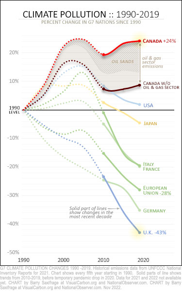
Let’s start by looking at the impact of rising emissions from the oil and gas sector. My first chart shows annual emission levels compared to 1990. That’s the international year for comparing emissions. The chart continues up to the start of 2020 — just before the pandemic-induced global recession hit. Also, note that the solid part of each line highlights the trends over the most recent decade.

At the top of the chart is a red line showing Canada's total emissions. Our annual emissions are up 24 per cent since 1990.
Below that line is an area of brown shading. This lets you see the role played by rising emissions from our oil and gas sector. The darker part of this shading shows the oilsands component. It caused three-quarters of the emissions increase in this sector.
The black line below the shading shows the emissions for all the rest of Canada. As you can see, even when we exclude the oil and gas sector, Canadian emissions from all other sectors combined are still well above their 1990 starting line. And equally troubling, they are also heading in the wrong direction.
To put these Canadian trends into a broader context, I included our peer nations in the Group of Seven (G7) major economies. You can see that all of them, except the Americans, have already cut emissions below 1990 levels. And even the Americans are well ahead of us. Leading the pack are our Commonwealth peers, the British. They’ve cut their emissions by 43 per cent.
This chart shows that even without our oil and gas industry dragging us backwards, the rest of Canada remains well behind our G7 peers. Not only are we behind, we’re also the only G7 nation that increased emissions over the last decade. You can see this clearly on the chart by looking at the solid part of each line.
The role of each Canadian sector
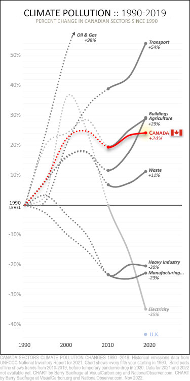
To see where emissions are rising and falling in the rest of Canada, my next chart shows the trends for each sector. Canada breaks down our national emissions into the eight sectors shown below.

The oil and gas sector, as noted above, is our biggest and fastest-growing source of emissions. Its emissions have doubled since 1990. You can see its line rocketing off the top of the chart.
But three other sectors have also increased emissions even faster than our national average. Transportation emissions shot up 54 per cent. And both the buildings and agriculture sectors' emissions jumped 29 per cent.
In contrast, three sectors reduced emissions. The heavy industry and the light manufacturing sectors both reduced emissions by around 20 per cent. And the standout climate success in Canada so far — the electricity sector — reduced emissions 35 per cent.
Those are the long-term trends. Now take a look at the last decade, shown by the solid parts of the lines on the chart. Seven of Canada’s eight sectors increased emissions over this last decade. Only our electricity sector managed to lower emissions.
And while our best performing sector — electricity — has cut emissions by more than a third, it’s worth noting that Germany (the world’s fourth-largest economy) reduced all its national emissions by the same amount. And, as we also saw in the first chart, the British (the world’s fifth-largest economy) reduced their nation’s emissions by even more than that — cutting them 43 per cent.
Megatonnes piling up
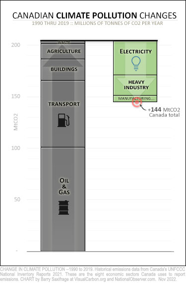
So far, we looked at the percentage changes in each sector. I’ll wrap up with a chart showing these changes in terms of millions of tonnes of CO2 (MtCO2). The height of each bar on the chart shows the size of emissions changes since 1990. Grey bars are emissions increases; green bars are decreases.

The biggest grey bar is, unsurprisingly, the oil and gas sector. Its annual emissions are 100 MtCO2 higher than in 1990.
The three large grey bars on top of that — for the transport, buildings, and agriculture sectors — combine to pile on another 100 MtCO2.
Heading the other way, towards climate safety, are the green bars for the electricity, heavy industry, and light manufacturing sectors. Combined, they lowered their annual emissions by around 60 MtCO2. That offset less than a third of the emission increases from the other sectors.
One climate step forward, three steps backwards.
Canada’s annual emissions are 144 MtCO2 higher than when we first started promising to reduce them three decades ago.
And our annual emissions even without the oil and gas sector are 44 MtCO2 higher. A big reason is the huge surge of emissions in our transport sector. On the chart, you can see that its emissions increase (in the grey bar) is larger than all of Canada’s emissions reductions (three green bars). So our transportation choices alone have wiped out all the climate progress made in Canada.
What these charts highlight is that Canada’s climate pollution problems are widespread throughout our economy. Clearly, our oil and gas sector has been the major driver of climate failure in Canada. Unfortunately, it’s only about half of our rising emissions problem. Emissions have also been stubbornly rising in most other sectors as well.
-------------------------
ENDNOTES
Where are we now in 2022 — Recent global estimates show that emissions worldwide have fully rebounded from the 2020 pandemic dip, hitting a record high in 2022. If you’re like me, you’d probably like to know where Canadian emissions trends are now, as well. Unfortunately, the Canadian government waits until the United Nations deadline to release our nation’s emissions data. That isn’t for another year and a half. So, until sometime in April 2024, the best we can do is to look at the structural trends in our economy that were in place before the pandemic hit.
More on U.K. versus CANADA — For those looking for more on the different climate actions taken by Canada versus the U.K., here’s a link to my most recent article looking into it. I also strongly recommend this Bloomberg Zero podcast with one of the principal architects of the U.K.'s 2008 Climate Change Act.
More on the transport and building sectors — For those wanting a more in-depth discussion on sector trends, here are links to my articles covering Canada's transportation sector and building sector.


Comments
Yabbut Canada is a climate leader. Justin Trudeau says so.
Canada's O&G industry grossly under-reports its emissions of all types. Canada's emissions stats are fiction. Canada's actual emissions are even higher than Barry's graphs present.
"Canadian methane emissions are vastly underestimated' (CP, Nov 14th 2022)
"A recent survey of oil and gas facilities in Canada found widespread methane releases. Satellite imagery saw giant plumes of the gas escaping landfills. And published research suggests claims of success at curtailing the gas may be partly the result of accounting changes, not actual reductions.
'If we thought it was bad, it's worse:' Alberta methane releases underestimated" (CBC, 2017)
Canada also uses creative accounting to under-report its forestry emissions:
Barry Saxifrage: "As Canada's forests become carbon bombs, Ottawa pushes the crisis off the books" (March 30 2020)
"Government accounting masks carbon emissions from forestry" (CP, Oct 18 2022)
"An analysis suggests Canada is using questionable methods to dramatically underestimate greenhouse gas emissions from the forestry industry, which it says equal those from Alberta's oilsands in some years."
And then there's agricultural methane, and methane from dumpsites, both of which have been either un- or under-reported.
The UK has its own special brand of greenwashing, in which buying pelletized prime wood from large old-growth trees, transporting it actoss a continent and an ocean, then burning it to make electricity, counts as "green."
At this point, with all the futzing and prevaricating and posturing and dissembling, there needs to be a uniform method of counting, and third-party measurement.
... and then again, when people sit in the dark and cold because they can't put any more coin into the electricity meter (just like the phone, pay as you go, a coin at a time), one wonders if that's a "fair green" way to reduce consumption.
The thing is, moving strongly to renewables is the best way to make electricity more affordable; witness the price on the big new offshore wind contracts in the UK (https://www.reutersevents.com/renewables/wind/uk-awards-7-gw-offshore-w…) or what's happened in Australia (Ketan Joshi's 'Windfall'). Renewables are a windfall for all of us - just not for oil companies.
Perhaps it's long past the time to look at other countries to see what they are doing to reduce emissions. Our own plans don't seem to be having the necessary results.