Canada's climate pollution numbers are finally out for 2021. Our emissions went up that year. This was widely expected because economic activity had partially rebounded from the pandemic-induced drop the year before.
Our government claims the increase is actually good news. Its press release is cheery: "The latest greenhouse gas emissions data gives an encouraging picture of progress." The reason to celebrate? Emissions didn't rise as much as the government "expected," which apparently indicates our climate policies are finally kicking in. In fact, the federal government boldly states that "Canada’s emissions are going down."
Most articles I've read in the press have followed along, emphasizing this "up-means-down" meme.
When I went looking through the numbers, however, I found the opposite story. For one thing, Canadian emissions did the same thing after the last global crisis. And that certainly didn't signal falling emissions. Instead, emissions went up in the following decade.
The deeper I dug into the data, the more discouraging the trends looked. For example, if you exclude our electricity sector, emissions across the rest of our economy were record high when the pandemic hit. With few emissions left in our electricity sector to slow us down, the surging emissions trend underlying the rest of our economy threatens to rocket us into an increasingly destabilized and dangerous climate future.
To illustrate the troubling emissions trends I found in the latest data, I've created six charts. Take a look at what they show and decide for yourself.
The big picture
I’ll start with the big picture.
My first chart compares Canada’s emission trends with those of our peers in the Group of Seven (G7). Collectively, these wealthy, industrialized nations emit one-third of global climate pollution and produce half the world's GDP. If we are going to have any shot at preventing a full-blown climate crisis, this group with much of the world's financial resources, capabilities and talent must lead the way.
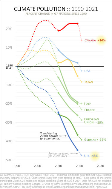
As you can see, emissions in all G7 nations were headed downward in the decade before the pandemic hit — except in Canada. This is shown by the solid part of each line.
The dashed end to each of those lines shows the trend over the two pandemic years we have data for: 2020 and 2021. At that point, all G7 nations were emitting less than they did in 1990 — except, again, Canada.
For example, the United States is the world's largest economy. Its emissions have been steadily declining for more than a decade and are now a bit below its 1990 level.
The European Union is the world's third-largest economy. It's cut its climate polluting by nearly a third since 1990.
And our Commonwealth peers, the British, have the world's sixth-largest economy — one and a half times the size of Canada's. It's cut its climate-destabilizing emissions in half.
Canadians have the world's 10th-largest economy. As our red line at the top of the chart shows, we are the climate rogues in this group. We are far apart from our peers and we still emit much more than we did in 1990.
How did we end up so far behind our G7 peers?
To start with, we increased our emissions the most during the 1990s and 2000s. That’s shown by the dotted lines on the chart. And then, critically, we were the only ones that increased our emissions during the 2010s. That widened the gap even further. This can be seen by the solid lines on the chart.
As the chart shows, during the normal economic years leading up to the pandemic, Canada's emissions were not heading downward.
The pandemic drop and rebound
During the first year of the pandemic, emissions plunged in every G7 nation. And then emissions rose in all of them during the second year. On the chart below, I've shown this 2020 dip and 2021 rise as bold black lines.
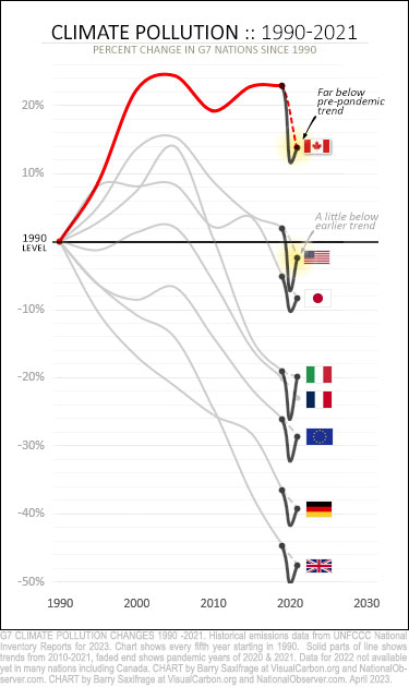
What jumps out at me about the pandemic years is that most of these nations have already rebounded back up to their pre-pandemic trend.
For example, both the European Union and the United Kingdom are right back on trend.
Two nations, however, are clearly below their earlier trend: the United States and Canada.
In the United States, estimates show 2022 emissions rising yet again. That means it, too, has rebounded to close to its pre-pandemic trend.
That leaves Canada as the only G7 nation far below its pre-pandemic trend. Our relatively small rebound in 2021 is what the government and many pundits point to as evidence we are breaking from our past and finally bending our emissions curve down now.
But a look back at the last global crisis shows that our emissions did the same thing back then. And our emissions went up — not down — afterward.
Déjà vu?
The data shows we've been here before.
Here's a chart that lets you compare Canadian emissions after the last two big global crises — the financial meltdown in 2009 and the pandemic starting in 2020.
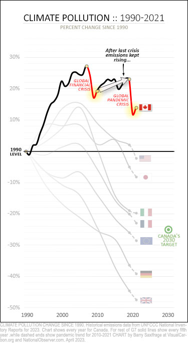
On this chart, I've shown every year of Canadian emissions, instead of five-year trends. This lets me highlight (in red) the early years of both crises.
Notice how both times our emissions plunged as the crisis hit. And then how both times emissions only rebounded a small amount in the following year.
That small rebound after the earlier crisis didn't herald the start of falling emissions. Just the opposite. As the chart shows, Canadian emissions kept muddling their way higher for another decade — until the second crisis hit.
With no clear sign in these top-level numbers that Canadian emissions have broken from the past trends and are now suddenly heading down, I decided to look for trends at the sector level.
Canada's one-trick pony
As many readers know, most of Canada's emissions cuts have come from cleaning up one sector — electricity generation.
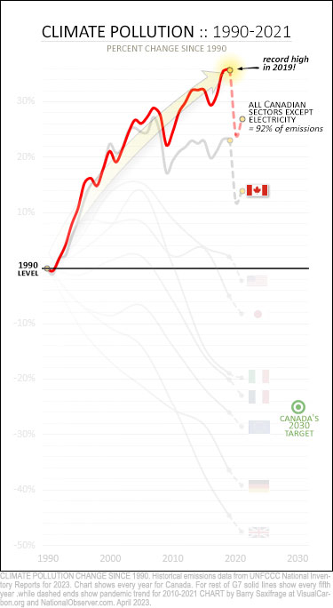
Less well-known is how our emissions have been surging across the rest of our economy.
My next chart shows this clearly. That red line rocketing upwards is emissions from all Canadian sectors except electricity generation. That includes oil and gas production, transportation, buildings, agriculture, industry and everything else.
As you can see, emissions from the rest of our economy have risen relentlessly. They shrugged off the last global crisis and were record-busting high when the pandemic hit.
To make matters worse, an eye-watering 92 per cent of Canadian emissions are now in that red line.
Does that look like an economy that was primed to cut emissions before the pandemic hit?
What that looks like to me is an economy slamming the pedal to the metal on emissions growth under normal economic conditions.
The only significant counterweight has been deep emissions reductions in our electricity sector. And now just eight per cent of our climate pollution remains in the electricity sector. So, there is little more our one-trick pony can do for us.
Where will climate progress come from now?
Here's a look at the emissions from each Canadian sector since 1990.
The red bars show sectors that have increased emissions. And the height of each bar shows the size of the increase in millions of tonnes of CO2 (MtCO2). For example, the oil and gas sector has increased emissions by 90 MtCO2 since 1990.
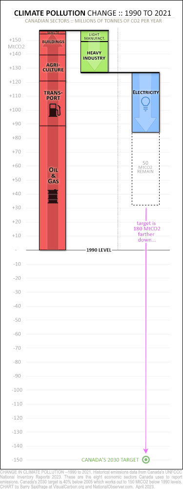
The green bars show sectors that decreased emissions. Yeah, not much there. And half of the reduction by the heavy industry sector came from the 2009 shutdown of our nation's only factory producing adipic acid, used to make nylon.
The only sign of significant decarbonization on this chart is the electricity sector. I've separated it out in blue. And below that blue bar, I've added a dashed empty box.
This dashed box lets you see how many emissions remain in the sector (50 MtCO2).
So, even if we completely switch to 100 per cent clean electricity nationwide, it would only lower our emissions by that much. As the chart shows, that's not even enough to get our climate polluting back to our 1990 level.
Our climate target just eight years from now is another 180 MtCO2 below that shown by the looooong purple arrow.
All those emissions cuts have to come from those red and green sectors. Remember that last chart showing emissions rocketing upwards unrestrained from these sectors?
Yeah.
The ever-steepening path to our 2030 target
I'll wrap up with a look at past Canadian foot-dragging, and what's required now to hit our Paris Agreement target in 2030.
On this final chart, the red line shows Canada's total emissions, from all sectors. And the green bull's-eye in the lower right shows Canada's Paris Agreement climate target for 2030. It is 25 per cent below our 1990 level — roughly where France's and the European Union's emissions are now.
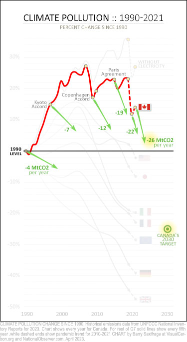
If we'd started back in 1990, when we first promised to cut our oversized emissions, we'd only need to be cutting four MtCO2 per year to reach our target. That's shown by the green arrow starting in 1990.
Many of our G7 peers opted for that kind of slow and steady route. They have a lot fewer emissions left to cut now.
We dragged our feet instead.
If we'd started when we said we would at the 1997 Kyoto Accord, we'd need to cut seven MtCO2 per year now. That rose to 12 MtCO2 per year by the 2009 Copenhagen Accord. And hit 19 MtCO2 per year by the 2016 Paris Agreement. That should have been a wake-up call because Canada has never cut our climate pollution that much in any non-crisis year.
But we dragged our feet for a few more years. Those wasted years meant that even our massive emissions drop in 2020 wasn't enough to make up ground. After that, we needed to cut 22 MtCO2 per year.
And then, in 2021, our emissions went up again — requiring us to now cut 26 MtCO2 per year for nine straight years.
If our emissions went up again in 2022 (something our government won't tell us for another year), we'll need to cut 30 MtCO2 or more per year.
Canada first promised to cut emissions back in 1988. Thirty-five years ago. At some point, we have to cut our emissions — all the way to zero. Decades of foot-dragging have turned what could have been a gentle, graceful ramp downwards into a vertiginous cliff.
Taking action?
I found no sign in the new numbers that Canadian emissions were falling before the pandemic hit. In fact, our emissions outside the electricity sector were record-busting high and heading higher.
The data shows that the small emissions rise in 2021 isn't unusual for us. We did the same thing last time and ended up with a decade of rising emissions.
The only significant counterweight to our economy's long-term trend of rising emissions has been the electricity sector. But that's nearly tapped out — leaving us with our underlying trend of up, up, up.
Given such dismal pre-pandemic trends, I can certainly see the desire to try to spin a hopeful story out of something as mundane as a smallish emissions rise in 2021. But hope isn't action and can even get in the way.
In her latest book, Greta Thunberg urges us to reconsider what we are using hope for: "Right now, many of us are in need of hope. But what is hope? And hope for whom? Hope for those of us who have created the problem, or for those who are already suffering its consequences? And can our desire to deliver this hope get in the way of taking action? …"


Comments
Barry, you really did the National Observer proud and served Canadians like a word warrior should in this piece. I will share it with several of the climate change action groups I belong to in Nova Scotia. The visuals do some good work in the article and hopefully will result in some good works in the world. You could usefully turn this piece into a video presentation people like me could use in Town Halls to replace politicians' fake news with reality. If the people don't have the truth, we will never back them into the corner where they belong. :-) Until they admit defeat and do the will of the people. Your accountability report is probably going to be the highlight of my busy day. Don't know how many will be at the Fridays For Future gathering in Antigonish in front of the town hall from 12-1. Do know that they will all be asked if they have seen your piece and I will provide the opportunity if they have not. All good things, Sandi
It would have been interesting to also look at Canada and see the data with and without Alberta included. Other data shows that Alberta contributes a significant amount to the overall data. From what I have read, Alberta's contribution has only increased, making it difficult to see how the rest of the country is shaping up.
Canada's dire situation is even worse than the analysis suggests. Canada grossly under-reports O&G industry emissions — its highest-emitting and fastest-growing sector.
The climate plan of the Trudeau Liberals and provincial NDP in AB and BC is premised on fossil-fuel expansion. A plan to fail.
As an Observer piece noted this week, Canada uses creative accounting to hide its logging industry emissions, which rank close behind the oilsands industry's. Barry Saxifrage has written on this as well.
"Canada should close the logging gap in its climate plan"
https://www.nationalobserver.com/2023/05/09/opinion/canada-should-close…
Prospects look dim. To reduce upstream oilsands emissions, the Trudeau Liberals are banking on a triad of taxpayer-funded white elephants: carbon capture, SMRs, and blue hydrogen. All of which mainly serve to perpetuate the fossil fuel industry; reduce a small fraction of upstream emissions at huge expense; and do nothing to address the 80-90% of emissions from a barrel of oil generated downstream at the consumer end during combustion.
If this is "climate leadership", what does climate failure look like?