Support strong Canadian climate journalism for 2025
Canada still has eight years to achieve our 2030 climate target. But rising emissions over the last two years look like they've already pushed it out of reach. That’s because we are now at a point where each wasted year makes the remaining task overwhelmingly larger.
Have we already run out the clock on climate hope in Canada? Take a look at these five charts and decide for yourself.
The rising cost of delay
My first chart shows the rapidly steepening path to Canada’s 2030 climate target.
The black line shows Canada’s past emissions. The green bull's-eye in the lower right is our target. And all those green arrows let you see the ever-steepening path to get there over the years.
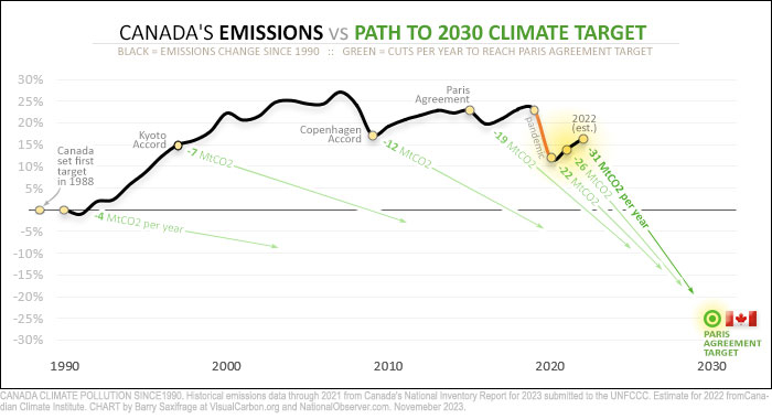
Notice that 35 years ago, when Canada first promised to reduce planet-heating emissions, the path was a gentle ramp. That’s shown by the green arrow to the far left on the chart. If we had acted then, we would only have had to cut four million tonnes of CO2 (MtCO2) per year — less than one per cent per year. As we will see below, that’s essentially the path the Europeans took.
Instead, Canadians wasted decades while our emissions drifted higher. Along the way, our path slowly grew steeper.
Now fast-forward to the recent years on the chart (highlighted in yellow). In 2020, the global pandemic shrank Canada’s economy and knocked our emissions down by a record amount. At that point, Canadians needed to cut 22 MtCO2 per year to reach our target. But instead of cutting emissions in 2021, we increased them. This rocketed our needed cuts up to 26 MtCO2 per year. Then, last year, we increased emissions again, according to estimates by the Canadian Climate Institute. This shot our needed cuts up by even more — reaching 31 MtCO2 per year.
And if we increase emissions again this year — like we did after the last global economic downturn — then our needed cuts will leap by an even larger amount.
That’s the brutal math of foot-dragging. The penalty for failing to act is small early on, leading to complacency. But towards the end, small delays carry overwhelming penalties. That’s the position Canadians are in now.
Unprecedented emission reductions needed
My second chart illustrates how huge our needed cuts are now.
It shows the annual change in Canadian emissions since 1990. This allows you to quickly compare the annual cuts we need now to what we’ve done in the past.
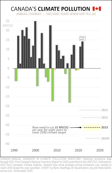
The black bars show increases. For example, the rightmost bars show the increases in 2021 and 2022.
The green bars show years when we reduced emissions while our economy grew. Yeah, not many and mostly tiny.
Now compare what we’ve done to the 31 MtCO2 we need to cut each year — for the next eight years — to meet our target. Those needed cuts are shown by the highlighted line way down on the right.
As you can quickly see, Canadians have never reduced emissions by anything close to this amount in any normal economic year. Not even once.
This chart also shows how fast the penalty for failing to act is now growing. The amount we needed to cut in 2021 and 2022 is shown by grey dashed lines. Note how these dashed lines are plunging further downward with each wasted year. I’ve added a bottom one, labelled “2024?” That’s what we face if we increase emissions again this year.
As I noted above, this chart excludes years when Canada’s economy shrank. This has happened twice since 1990. Both were driven by global crises — the 2009 financial meltdown and the 2020 global pandemic. They are marked by orange dots on the chart. Those years obviously aren’t relevant comparisons because Canada isn't planning to intentionally shrink our economy.
Cuts versus current emissions
My third chart provides another way to visualize how improbably huge our emissions reductions need to be.
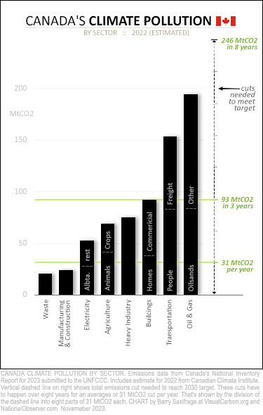
On this chart, the black bars show Canada’s current emissions broken down by sector.
Emissions range from a low of 20 MtCO2 per year from our waste sector, up to nearly 200 MtCO2 per year from the oil and gas industry.
You can compare those to the reductions needed to meet our target — shown by the tall, dashed line on the right.
In total, Canadians need to reduce our climate pollution by nearly 250 MtCO2 by 2030. As you can see, that’s far more than any single sector emits. For example, if we could eliminate all tailpipe pollution from every car and truck — large and small — across Canada, it wouldn’t be nearly enough on its own. We no longer have the luxury of targeting our cuts in just one or two sectors.
Each year, we need to cut another 31 MtCO2. That amount is shown on the chart by the lowest green line. To appreciate what it would take to cut that much just once, consider that:
- Completely eliminating all emissions from our manufacturing and construction sector (24 MtCO2) wouldn’t be enough to cover even one year.
- Switching all of Alberta’s electricity generation (28 MtCO2) to renewables wouldn’t either.
- And neither would switching every home in Canada to electric heat pumps (~20 MtCO2).
The next few years will go by quickly. To appreciate what is needed over just three years, look at the chart’s upper green line. It marks 93 MtCO2 in emissions reductions. For scale, every three years we need to cut:
- More than the oilsands industry emits.
- More than all Canadian buildings emit.
- More than all the cows in Canada emit.
The clear takeaway from this chart is that Canadians need to dramatically reduce our climate pollution across all sectors. Everything all at once. And because fossil fuel burning causes most of it, we need to rapidly ratchet down the amounts we burn in all parts of our economy and lives.
If we haven’t already started cutting fossil fuel emissions this year, then our task in future years will grow ever more extreme.
What can we learn from our peers?
My fourth chart shows the paths our peers in the Group of Seven (G7) have taken.
Collectively, these wealthy, industrialized nations emit one-third of global climate pollution and produce half the world's GDP. If we are going to have any shot at preventing a full-blown climate crisis, this group with much of the world's financial resources, capabilities and talent must lead the way.
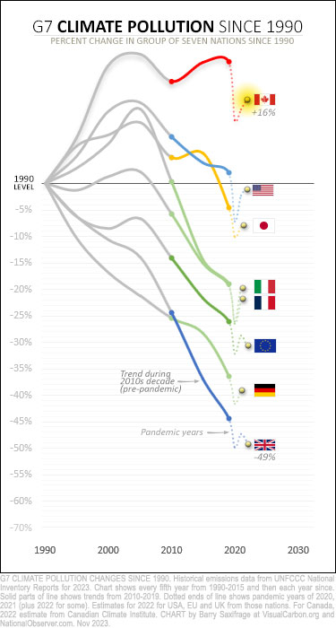
On the chart, the line showing each nation's emissions is divided into three parts. The 1990s and 2000s decades are grey. The 2010s decade is coloured. And pandemic years since then are dotted. At the end is a yellow dot and flag showing the most recent emissions. As you can see, all G7 nations now emit less than they did in 1990 — except Canada. We still emit far more.
The path all our G7 peers took downward was to steadily reduce emissions over a decade or more. You can clearly see a long decline for each nation except Canada on the chart.
For example, look at the trends during the last decade, the 2010s. I’ve shown these years as colourful solid lines. Notice how all G7 nations — except Canada — reduced emissions during that critical decade.
We, alone, wasted that decade. Our foot-dragging left us ever further behind our peers. Just look at that gigantic 65 per cent action gap that has opened up between what our Commonwealth peers in the United Kingdom have done with their climate pollution versus what we’ve done in Canada. We've been choosing to fail.
My final chart adds each nation’s 2030 climate targets.
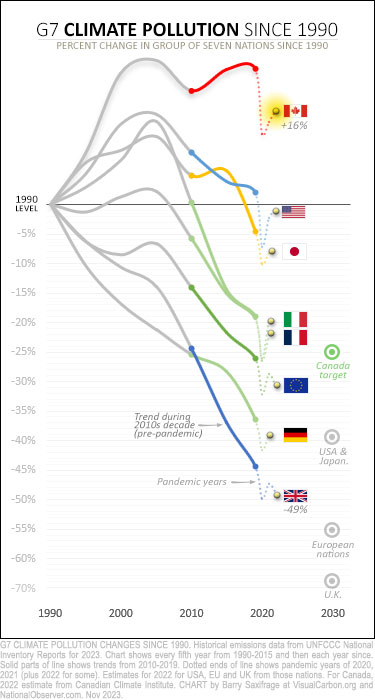
Canada’s 2030 climate target is shown by the green bull's-eye. It’s the weakest in the G7, at 25 per cent below our 1990 level.
It’s worth noting how other nations managed to reduce their emissions to the level we are aiming for.
For example, the U.K. has led the world in cutting climate pollution. It took them two decades of steadily reducing emissions to get to that level. And it took the European Union nearly three decades.
Canadians have just eight years left to get there, and we aren’t even back to the 1990 starting line yet. Not even close.
What these last charts show is that the nations that have made deep cuts to emissions have done it by consistently reducing emissions for decades.
To consistently cut emissions, it helps to have economy-wide policies that force reductions all along the way. A great example that we could adopt at any time is the U.K.’s Climate Change Act of 2007. It legally requires the government to meet sharply falling carbon budgets that cover all emissions in every year. And it set up an independent commission with broad powers to develop legislation and to keep the nation on track to meet current and future budgets.
We could still do it …
I guess this is the point in a climate article when I’m supposed to offer some hopeful “we-can-still-avoid-saddling-all-future-humans-with-a-dystopian-climate” scenario.
But after 35 years of broken promises and failed half-measures in Canada, it’s hard to see any hopeful scenario Canadians are willing to act on. We certainly know what we need to be doing. We just refuse to act — year after year, decade after decade.
As we continue super-emitting — even as climate impacts grow ever more extreme — my thoughts keep returning to Elizabeth Kolbert's closing observation in her early climate book, Field Notes from a Catastrophe: "It may seem impossible to imagine that a technologically advanced society could choose, in essence, to destroy itself, but that is what we are now in the process of doing."
Maybe we just aren’t going to save ourselves after all.



Comments
The political will is not there to seriously address climate change in Canada. The country is increasingly being run by big oil and rogue premiers like Danielle Smith, Scott Moe snd and Doug Ford.
I agree and let me add petty P.P. and his populist "ax the tax" slogan which he hopes he can use to ride into the PM"s office. Egging people on to take zero responsibility only plays further into the ambitions of the fossil fuel industry which has zero intention of slowing down, in fact only want to ramp up their production. The Conservative clown show are the exact enablers they need in power to do so.
Since. a majority of these companies are foreign owned, it would not surprise me one bit if foreign money is and has and will find its way into their political coffers.
Totally agree...
Not only is the political will not there with our rogue premiers like Danielle Smith (owned 110% by oil & gas), Scott Moe and Doug Ford, you can add our Federal leaders, Pierre Poilievre (the party that won't acknowledge climate change is real), but Justin Trudeau who is all talk, but zero action when it comes to climate change. It seems all of them cater to oil & gas, but Danielle Smith is a poor excuse as a premier, she works for oil & gas and not the people of Alberta.
The next big problem is the conservative base (some, but not all) and the so-called naive fringe who turn their middle finger up to anything that helps with climate change or the rule of law. But you can also include the middle or left, who want their cake and eat it too. Canadians agree climate change is real, but don't want to sacrifice anything to help achieve the goals. Unfortunately, it doesn't work both ways.
Given our past dismal record at meeting targets, 2030 will be no different. The blame will lie at the feet of our rogue premiers and Justine Trudeau who lacked the backbone to do what was right for the country.
"Justin Trudeau who is all talk, but zero action when it comes to climate change."
Trudeau has done plenty on climate. In fact, the Trudeau Liberals have done more on climate than any previous government.
Faint praise.
- Buying and building a new oilsands export pipeline (Trans Mtn expansion) at huge loss to taxpayers.
- Approving new LNG projects in B.C.
- Approving new offshore oil projects on the East Coast (Bay du Nord).
- Subsidies: The Liberals continue to funnel billions of public dollars to the massively profitable, largely foreign-owned O&G industry."Canada leads G20 in financing fossil fuels, lags in renewables funding, report says" (CP,2021)
"Canada's billions in fossil fuel subsidies under mounting scrutiny" (National Observer, 2023)
- Big bets on fake climate solutions: taxpayer-funded white elephants like carbon capture, SMRs, and blue hydrogen that are costly, inefficient, don't exist yet, or don't work.
- Carbon pricing schemes that shield large industrial emitters from carbon pricing. - Latest cave-in to Atlantic MPs on the carbon "tax" for heating oil.
Canada's climate plan is based on fossil fuel expansion. Trudeau's (actually, corporate Canada's) idea is to "green" (i.e., greenwash) its fossil fuels at the upstream end, not get off them. Incoherent climate policy designed to fail.
When the IPCC issued its latest report, then-Environment Minister "Wilkinson reaffirmed Canada's commitment to phasing out fossil fuels and achieving net zero carbon emissions by 2050, but said achieving that target will require money generated by fossil fuels."
"Ottawa says it must maximize revenue from the Trans Mountain pipeline to fight climate change" (CBC, 2021)
Justin "pipelines-for-climate" Trudeau has served Corporate Canada's climate agenda admirably. Not the IPCC's.
In reality, Trudeau and Poilievre are the Tweedledum and Tweedledee of climate disaster. Both parties serve Corporate Canada. Only the Liberals are far more effective.
Big Oil couldn't ask for a better setup. Terrified by the Conservative bogeyman, progressive voters run into the arms of Trudeau's Liberals. CAPP sets their Conservative hounds on the Liberals, while the Liberals give the O&G industry just about everything on its wishlist. The Liberals play the fear card every election to limit the NDP and Green vote.
Progressives fall for it every time.
"Canada is a continually bad actor on the global stage, despite protests that Justin Trudeau is ruining the oilsands. Drawing on research from Quebec's French-language newspaper Le Devoir, the New Democratic Party has argued Trudeau has been kinder to Big Oil than Stephen Harper ever was. He has also been crueller to the most vulnerable."
"Oil and gas approvals spell ecocide" (National Observer, 2023)
Backsliding petro-progressive governments are instrumental in the rise of right-wing extremism and denialism.
The petro-progressive provincial NDP and federal Liberals are not in a tug-of-war with Conservatives over climate. They are dance partners. The NDP and Liberals promote fossil-fuel expansion and take science-based options off the table. This allows the "conservatives" to shift even further right, doubling down on denial and fossil fuel intransigence. But it's Notley and Trudeau who shift the Overton window. It's Trudeau, Notley, and Horgan who shut down the space for science-based climate policy.
The climate plans of the Liberals and provincial NDP are premised on fossil-fuel expansion. It's the Liberals and NDP who ignore the science and undermine the climate movement.
When Danielle Smith jams a wrench into the spokes of renewables, or Poilievre promises to axe the tax, progressives fight back. When the NDP and Liberals build pipelines, progressives applaud or stay silent.
"At least, it's not the Conservatives."
Trudeau and Notley moved the ball on the Trans Mountain pipeline down to the ten-yard line. Their signal achievement was to "push country-wide support for pipelines from 40% to 70%." Something Harper, Scheer, Kenney, Smith, and Poilievre could never dream of doing.
Trudeau, Notley, and Horgan did something else Poilievre and Smith could never do: lead progressives over the climate cliff. Many of their acolytes now embrace fossil-fuel expansion.
When Poilievre and Smith say no to a shift away from fossil fuels, the progressive option is still ON the table.
When Trudeau and Notley say no, they took the progressive option OFF the table.
When Poilievre and Smith deny the science, progressives reject their arguments and head in the opposite direction.
When Trudeau and Notley deny the science, progressives accept their arguments and enable their climate sabotage.
"A recent study from Oil Change International found Canada is on track to be the second-largest fossil fuel expander, behind the United States, by 2050. On its own, Canada's planned fossil fuel expansion represents 10 per cent of the world's expansion plans, creating the equivalent greenhouse gas emissions of 117 coal plants running for decades.
"In light of the country's planned fossil fuel expansion, highlighting Canada's carbon capture strategy that's being used to justify further planet-scorching fossil fuel production at COP28 is unlikely to go over well.
"'The idea of Canada as a leader in this area is laughable,' MacLean said. 'Its record since 1990 speaks for itself.'
"'Nobody outside of Canada who knows anything about climate policy sees Canada as anything other than a laggard.'" (National Observer, 2023)
Mark Jaccard's "climate-sincere" Liberals.
Translation:
We're fucked.
I could go on and on and on forever slagging our dismal political leadership in all its glorious colours, and have done so for many years, to no avail. What a waste of life energy and time that is! It's an impossible task to affect big, positive change in politics when it's led by fallible people.
I could throw my hands up in despair about our hopeless situation. Yes, it's brutal and seemingly impossible to fix.
If it truly is hopeless, why bother living? Are we that masochistic? Is our need to ride it out to the bitter end that psychotic? Why not just escape through mass suicide and leave the planet alone to heal itself?
The reason we don't is hope. Hope is a finite human resource and shouldn't be wasted on the futility of trying to change other's behaviour overnight. It's too precious to be blown berating the political class and shaming their voters.
Hope needs to be placed where it is most effective, into making adjustments to our own lives and to promote CONSTRUCTIVE and PROACTIVE thinking and not excessively dwelling on all our failures, of which there is a bottomless well.
How can I spend half our life savings on electrifying our home as retired senior citizens? How can we adapt to more smoky summers with a family member who has severe asthma? Is my effort to affect change best spent wasting my vote punishing politicians or voting for the best possible political results among an inadequate and very limited set of choices? Is it better to continue being a vocal critic and write even more essays on possible solutions and the vital need to adapt?
The above will maintain hope and will be CONSTRUCTIVE. By all means, take to heart Barry's research and try not to get too depressed. But also read Michael Mann's calculations that there is a 30-year lag between a major reduction in emissions and a reduction in the rate of temperature increase, and understand that there is hope we can ride it out and be assured future generations will adapt and survive. There is also hope in the positive economic forces behind renewables that are immune to political rhetoric and misinformed narratives by politicians. And read Thomas Homer Dixon's book called 'Hope'.
Homer Dixon's 'The Upside of Down' was also very inspiring, and not quite as technical as 'Hope.' Building and (rebuilding after a collapse) needs to switch to longevity and resilience from the bottom line. Mike Holmes nailed it ... build it right the first time.
You also have people like Sam Evans (aka the Electric Viking) who provide a daily dose of optimism that is a nice antidote to doomerism. Here's one of his latest videos, "Fossil fuels have become obsolete..." which is backed by scientific research and citations.
https://www.youtube.com/watch?v=9Hu95nhDn8M
Thank you for this article. The graphs are very effective.
I agree that we lack the political will to take effective measures to reduce GHG emissions. Have we Canadians let politicians get away with this poor performance? Are we too complacent? I keep wondering why people will take to the streets and demonstrate about other issues (right now it's the Israel- Hamas war), but it seems hard to get people out for the issue of Climate Change. Yes, there have been huge demonstrations in the past but not much since the pandemic.
I keep asking myself what I can do? I have sent the article to my Conservative MP. It won't do any good, but he needs to hear that his constituents are worried and not pleased with his leader's denialism.
I plan to read Thomas Homer-Dixon's book Hope. Thanks for the recommendation.
When the cuts start coming, they'll come fast, and it'll be the same cold-hearted businessmen that pumped up the CO2 that do the cutting. The eV sales will show up first. Gas will start to decline for power across the prairies as wind and solar grow. But it'll be the 2030s before the big stuff happens. The Tar Sands are the least-profitable oil in the world, and when those are shuttered, it'll be a big step down.
I think you are describing an accurate potential future scenario.
The latest reports indicate that EV and grid-scale batteries dropped a whopping 30% in costs and purchase price this year alone, driven by a massive push in China. Some pundits who read the reports and do the analysis thus believe EVs will reach price parity with burner cars in as little as two years mainly through more affordable battery packs.
Petrol is the lifeblood of the oil sands. Alberta has not done the math and Albertans will pay the price by the time their most recent petrohead premiers are enjoying their exceedingly generous public pensions in comfortable retirement in Palm Springs.
Similarly, the latest solar PV technology just recorded a remarkable efficiency rating of 32.9%, which is phenomenal for PV. China is about to flood the world market with millions of these latest solar panels that are made in robot factories and thus are able to undercut the competition on both efficiency and cost. The best panels the West can produce are 28% efficient and made with high cost labour in Germany.
We can criticize China all we want for poor labour and environmental standards and the absence of democracy, but robot factories (whete labour standards are absent -- no work force) and low prices are what Chinese citizens have accepted, and China is merely capitalizing on the gaps the West built in its economies and climate action plans.
We bemoan Canada's laggardly status on climate, and rightfully so. But beyond our borders the progress is truly ramping up. That is worth celebrating because it's increasingly obvious that the global economic trends surrounding renewables will do the work our prime minister (Trudeau, Poilievre, whoever...) and premiers are utterly failing at, and drag or country kicking and screaming into the sunshine of the 21st Century.
Thanks again, Barry, for these illuminating graphs. Thanks also to commenters Pounder and Botta -- good points all. Still, it's been clear for a long time now, that Canada, a petrostate, is not meeting emission reduction expectations, in fact is doing the opposite. A comparison graph with other petrostates might be of interest.
I for one find no further utility in flagging this dead horse (but by all means plaster graphs like the G7 compariosn all over the place). As Botta says, we need to maintain hope by taking action -- in our personal lives, in our civic engagement, in our voting. By continuing to emphasize how terribly off-course we are and arguing that only increasingly steep reductions (which are unrealistic) can save us, the real danger is that we succomb to defeatism.
According to James Hansen et al. (“Global Warming in the Pipeline,“ Oxford Open Climate Change, 2 November 2023, peer-reviewed), the 1.5dC Paris target is dead as a doornail, because of all the heating that's already built in. He also convincingly argues that the IPCC models are too optimistic. So more fodder for defeatism.
No. Hope + Action, in every aspect of our lives.
Okay now do it by province. This isn't a Canada problem it's a Alberta/Saskatchewan problem. The rest of the country gets included but would be comparable to most European countries. Quebec would probably be one of the best.
Also remember it looks like a gradual uptick because you are ignoring the drop from Ontario shutting down it's coal plants that were completely offset by Alberta increasing production.
Excellent point. AB and SK are dragging the rest of the nation down. I believe Barry Saxifrage wrote about and graphed the provincial data a couple of years back. One conclusion was that if AB/SK were discounted, Canada would be on its way to meeting its Paris commitment.
One of my favorite fun facts is that the economic contribution of the entire "Canadian" fossil fuel industry (it is majority foreign owned in Alberta) to the national economy maxes out a titch above 8% annual GDP in its best years.
When the world price of oil tanked in 2014 and demand remained down during the pandemic that followed, it bottomed out at about 4%. Even with the post pandemic bounce in demand, it is today about 5%. Why can't the remaining 92-96% move boldly into the transition and absorb a single-digit loss?
When Alberta has its regular monthly anti-federal hissy fit, just remember that the tail cannot wag the dog no matter how hard it tries or loudly it barks. To do so would have to defy gravity.