Western Canada has a lot of explaining to do.
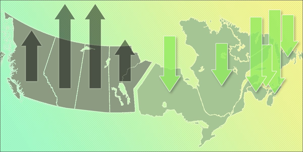
Canada’s recently released greenhouse gas inventory shows that every western province has increased its climate pollution since 1990, the international baseline year for measuring climate action.
On the other side of the country, every eastern province has reduced its emissions.
In this article, I'll cover this striking divide between Western Canada and Eastern Canada in two parts. First, I’ll present a couple of charts that illustrate just how far apart these regions are. Then, for readers wanting a deeper dive, I'll dig through the new data looking for what's driving this division.
West versus East
My first chart shows this West versus East divide. The lines on the chart show how each province’s emissions have changed since 1990.
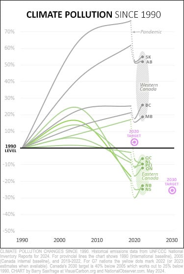
Western provinces are shown with dark grey lines. Notice how all of them — British Columbia, Alberta, Saskatchewan and Manitoba — have significantly increased their climate pollution.
Eastern provinces are shown by green lines. All of them — Ontario, Quebec, New Brunswick, Nova Scotia, Prince Edward Island, and Newfoundland and Labrador — now emit less than in 1990.
Canada’s recent climate targets are shown as purple bull's-eyes.
Our nation’s 2020 target (pledged under the global Copenhagen Accord) was just above our 1990 level of emissions. As you can see, all eastern provinces met this target. No western province got close.
Our nation’s next climate target, pledged under the global Paris Agreement, is coming up fast in 2030. It works out to 25 per cent below our 1990 level. Many eastern provinces will have to work hard to meet this one. But two of them are already down there, and the rest are at least in the right ballpark. Western provinces, however, remain recklessly far away, high up the crumbling climate cliff.
Canada versus its peers
To provide some international comparisons, I’ve added our peers from the Group of Seven (G7) nations to the chart.
Collectively, these wealthy industrialized nations emit one-third of global climate pollution and produce half the world's GDP. If the world is going to have any shot at preventing a full-blown climate crisis, this group with much of the world's financial resources, capabilities and talent must lead the way.
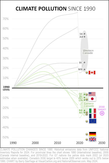
As this second chart shows, Canada is the only G7 nation still emitting more than it did in 1990.
And you can easily see why. Canada is being dragged away from its G7 peers by the ongoing failure of all our western provinces to rein in their climate pollution.
In contrast, all our eastern provinces are down with the G7 pack.
Quebec, for example, has reduced emissions by roughly the same percentage as the United States; Ontario has cut back to the same level as Japan; and New Brunswick and Nova Scotia are on par with Italy and France.
So far, no Canadian province has put in the effort needed to keep pace with global leaders like Germany and the United Kingdom (U.K.). Both of these top-10 global economies have cut their emissions in half.
The best option we have left is to start now. We should adopt key policies that work for our peers, like the U.K.'s successful Carbon Budget Act of 2008.
What’s going on with Western Canada?
The obvious question posed by Canada’s huge West versus East divide is: What's causing it?
Is there some big regional factor? If so, what’s the fix?
In the second half of this article, I dig through the data looking for the answer.
For those readers who want to skip the nitty-gritty details, the short answer is that I couldn’t find a simple answer. I had hoped to find a single factor that explained the divide. But what I found is that each province seems to be dancing to its own drummer. So, maybe the fact that all our climate-failing provinces are in the West is more random than regional.
For readers who want to see details of what I found and then draw their own conclusions, read on.
The role of the oil and gas sector?
The first thing I looked into was whether the oil and gas sector was driving the West versus East divide.
As most readers know, expansion by the oil and gas industry has caused the largest increase in Canadian emissions, and it is concentrated more in the West. So, is this sector responsible for the West's lack of climate progress?
Apparently not.
My next chart lets you compare provincial emission changes with, and without, the oil and gas industry.
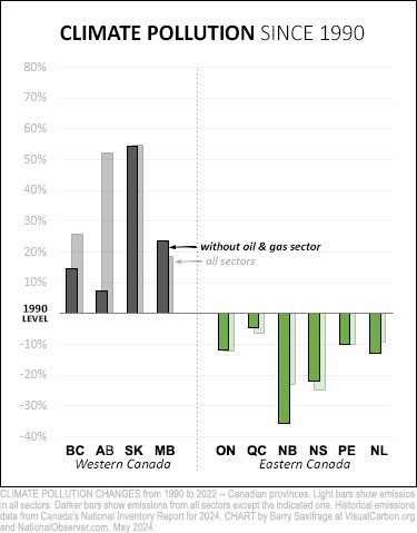
The light bars include emissions from all sectors. This is the change we focused on in the first half of the article. For example, B.C.’s emissions overall are 26 per cent higher than in 1990.
The darker bars exclude the oil and gas sector. They show you what each province has done with their emissions outside the oil and gas sector. For example, B.C. has increased emissions in all the rest of its economy outside the oil and gas sector by 15 per cent since 1990.
As the chart clearly shows, the West versus East divide is not driven solely by the oil and gas industry. All the western provinces have increased emissions outside their oil and gas sector. And all the eastern provinces decreased their emissions outside their oil and gas industry.
To be honest, I was surprised by how remarkably similar the pattern is with and without the oil and gas sector. The only province showing a dramatic difference seems to be Alberta. This makes sense given that Alberta hosts the oilsands industry, whose emissions have exploded since 1990.
The role of electricity generation?
The second factor I looked at is the electricity sector.
Nearly all emissions reductions in Canada, so far, have come from cleaning up electricity generation. And these reductions have been unevenly distributed across the provinces. Could this sector explain our West versus East climate divide?
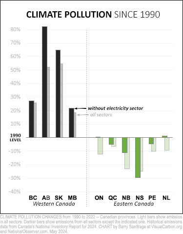
Again, the answer seems to be no.
Here’s the same chart as above, but this time I’ve excluded the electricity sector.
Comparing the light and dark bars shows that the West versus East divide is just as dramatic without the electricity sector.
Nearly every province is doing worse with their emissions outside the electricity sector than with it. But for some provinces, the difference is especially startling. For example, look at how high Alberta’s emissions have risen outside the electricity sector (dark bar) — up 80 per cent since 1990. And in Ontario, emissions progress since 1990 disappears outside the province's electricity sector.
The role of population shifting West?
The last single factor I looked at was population changes.
Overall, Western Canada has seen greater population growth than Eastern Canada. So, to adjust for different population growth rates in the provinces, I got population data from Statistics Canada and calculated provincial emissions per person. My third chart shows how emissions per capita have changed for each province.
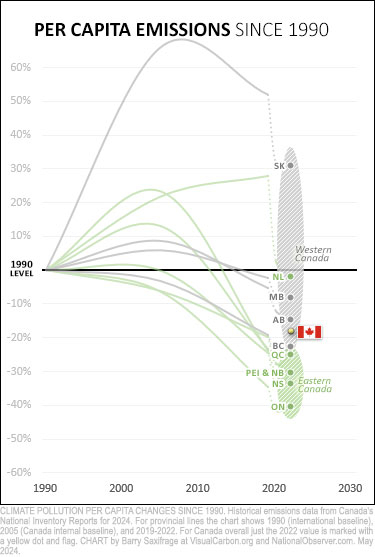
Once again, the West versus East divide shows up.
All western provinces have done less to clean up their emissions per capita than all the eastern provinces have.
You may have noticed that there is one exception in this case: Newfoundland and Labrador. That’s maybe not so surprising given its unique position as the only province having lost population since 1990.
Before leaving this chart, I think it’s worth noting the huge range in Canada on this measure of climate progress. At one extreme is Saskatchewan, which managed to increase emissions per person by 30 per cent. At the other extreme is Ontario, which has reduced emissions per person by 40 per cent.
The big geeky chart
Failing to find any single factor to explain our West versus East divide, I did what any data geek would do — I got a lot more data. The result is this big geeky chart below.
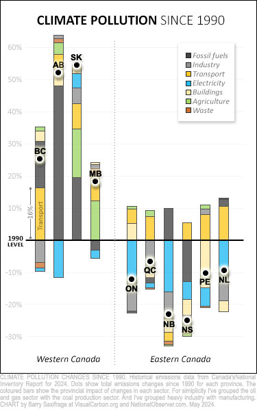
The dots on this chart show the overall provincial change we’ve been looking at in the earlier charts. For example, B.C.’s dot shows it has increased emissions 26 per cent since 1990.
All those coloured bars show sector changes within each province.
For example, B.C.’s largest bar is orange (transport). That tells us that transportation has had the biggest impact on this province’s emissions. The bar is 16 percentage points high. That tells us that transport has increased B.C.’s emissions by 16 per cent since 1990.
As we will see in more detail below, there isn't a strong pattern as to which specific sectors have the greatest impact across the provinces.
Instead, the strongest pattern I found on this chart concerns the number of sectors that are increasing versus decreasing emissions.
All western provinces have increased emissions. And in all of them, the majority of their sectors have also increased emissions.
All eastern provinces have decreased emissions. And in all of them, at least half their sectors have also decreased emissions.
This correlation holds up in the extremes, too. The provinces with the biggest emissions change, up or down, have the most sectors pointing in the same direction.
Everyone is dancing to their own drummer
As noted above, there isn’t a strong pattern concerning which sectors have the biggest emissions impact across the provinces. Instead, it seems that each province is dancing to its own drummer.
At least, that’s my takeaway after I walked through the top two sectors in each province. Below is a quick summary of these top two from coast to coast. Take a look at how extremely varied the mix is and see what you think.
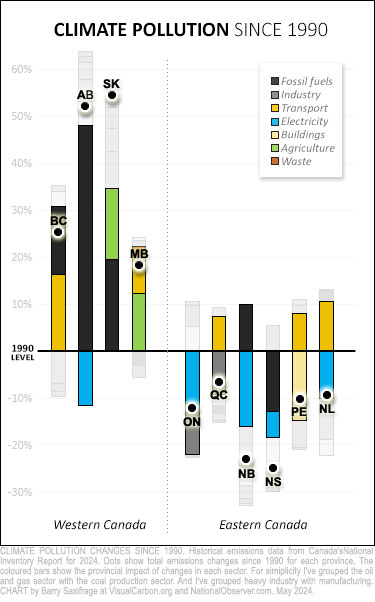
On the chart, I’ve highlighted the top two sectors while fading out the rest.
And here’s a written cheat sheet that lists the top two in order. Bold shows increased emissions, italics show decreased emissions.
BC: transport, fossil fuels.
AB: fossil fuels, electricity.
SK: fossil fuels, agriculture.
MB: agriculture, transport.
ON: electricity, industry.
QC: industry, transport.
NB: electricity, fossil fuels.
NS: fossil fuels, electricity.
PEI: buildings, transport.
NL: transport, electricity.
Amazingly, the one-two pairing is unique in each province.
I admit that I was both surprised and disappointed by this. Simple answers feel easier to deal with.
But I also know the classic climate mantra that there isn’t any silver bullet for solving the climate crisis — we need “silver buckshot” instead. And at the end of the day, all sectors in all provinces must reduce all emissions all the way down to net zero. That net-zero day is barrelling towards us quickly.
Fortunately, we have examples of peer nations that are successfully reducing emissions across all sectors, like Germany and the U.K. We can adopt the policies that have driven down emissions so successfully for them.
So, we know what to do. And we've known it for a long time now. We just aren’t doing it ... yet.
That holds especially true for our western provinces. Whether their collective climate failure is driven by some mix of regional forces or is just a random cluster of foot-draggers, it is long past time they stop dragging the rest of Canada back with them and finally join the race for a safe and sane future.



Comments
Fascinating, and a great tool to focus/prioritize emission reduction efforts where they can have the biggest return on investment. I wonder how much transport would improve if we stopped shipping fossil fuels?!
Simply brilliant! Bravo! How is it possible to ignore this?
Excellent research, cool graphics. Victoria, Regina, Saskatoon, and Winnipeg once had extensive electric rail transit systems. Today, zip.
Thanks for this. The top two areas that require improvement based on the last chart in the article are fossil fuels and transport. The link between those two areas seems clear and seem to point out the need to focus strongly on these two sectors.
Great article!
What I find especially disappointing is that transportation is such a low hanging fruit. Instead of going to hybrids and smaller vehicles, Canadians have opted for larger and larger gas guzzlers. It is sheer genocidal bloody mindedness and a black stain on Canada.
Thank you, Barry.
Some may also posit - "Why was the "revolutionary, multi-million dollar carbon capture" cancelled, why are provincial taxpayers paying for orphan well clean-ups, why are taxpayers paying for pipelines, who is ultimately benefiting in a "damn the planet" scenario?"
Since I live in Ontario and I’m active with Seniors for Climate Action Now (SCAN) I’m particularly interested in how Ontario compares to the other provinces. In the chart that removes the electrical sector emissions from the mix, the conclusion is that “… in Ontario, emissions progress since 1990 disappears outside the province's electricity sector.”
Emission reduction efforts by the Ford government have all but ground to a halt under Ford and his government plans to expand the presence of gas plants within the sector. This will reverse the progress made in Ontario from the elimination of coal-fired electricity generation.
Other interesting variables to consider would be the political stripe of the party in power as well as their emissions reduction commitments and track record in achieving them - or not.