Support strong Canadian climate journalism for 2025
Canadian emissions rose for the third straight year in 2023, according to the seventy-fourth edition of the venerable “Statistical Review of World Energy” report. The reason I’m turning to data in this report is because Canada won't release its 2023 numbers until next year. This delay, which can exceed two years, keeps Canadians in the dark about where we are and where we are headed.
Many of Canada’s peers in the Group of Seven (G7) nations have already published their 2023 emission estimates — including the United States (U.S.), European Union (E.U.), France, Germany and the United Kingdom (U.K.).
So, to try to provide some current insight into where Canadians are now in the climate fight — and what it will take now to hit our 2030 climate target — I’ve gathered all these numbers and created a series of charts.
Here’s what I found.
Post-pandemic leader becomes laggard
I’ll start by looking at what we've done with our emissions in the last few years. This first chart shows emission changes since the start of the global COVID pandemic.
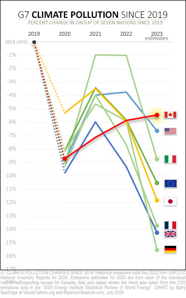
In 2020, the pandemic unleashed a global recession and emissions fell steeply in all these nations. This is shown by the plunging dotted lines on the left of the chart.
Canada’s emissions are shown by the red line. In 2020, they dropped about nine per cent — similar to most other G7 nations.
During the next year, 2021, emissions rebounded in all these nations. But that rebound was uneven as each nation recovered at a different rate.
In that first rebound year, Canada’s emissions rose the least in the group. This led to some rosy-eyed spin by Canada claiming "emissions are going down … we are almost a quarter of the way to our 2030 emissions reduction goal."
However, Canada's next two years of rising emissions have moved us to last place in the group since the pandemic hit. That’s not surprising because, as we will see next, Canada was the group laggard before the pandemic, too.
By contrast, all the other G7 members have reduced emissions over the last two years. And, as the chart shows, most of them now emit even less than they did during the huge pandemic drop of 2020. This is also not surprising because, as we will see, these results align with where they were headed before the pandemic.
Supertankers and long-term trends
It is often said that changing the direction of a nation’s emissions is like turning a supertanker. It takes a firm hand on the wheel for a long time before you can redirect all that momentum.
My next chart steps back to show the pandemic years in relation to the longer term (supertanker) trends. Each line on this chart shows how emissions have changed since 1990 — the international starting year for measuring climate action. The pandemic year of 2020 is again shown with dotted lines.
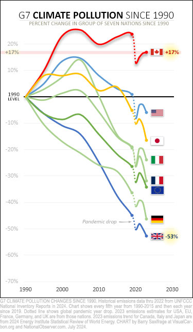
Let’s start at the top with Canada (red line). Before the pandemic hit, Canada’s emissions had been rising for a decade. Our “supertanker” was headed upwards. So, it shouldn’t be surprising that our emissions keep rising after the pandemic as well.
By contrast, the “supertankers” of all our G7 peers were headed downward in the decade (or three) before the pandemic. So, again, it’s not surprising that their emissions are heading down now.
More specifically, note how their emissions in the pandemic recovery period are roughly in line with where they were already headed. Their supertankers have maintained their course through the pandemic turbulence.
You can see this even more clearly in my next chart.
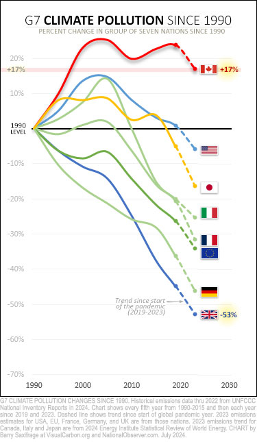
In this chart, I replaced the annual ups and downs of the pandemic years with a single dashed line. This shows the overall trend since the pandemic hit.
Emissions in all but one of these nations are roughly back in alignment with their pre-pandemic trends. The one exception is Canada.
Canada’s dashed line points in a dramatically different direction from where it was headed before the pandemic. Emissions were rising in the decade before the pandemic, but now they appear to be headed down.
What's going on?
One option is that Canada has implemented new climate policies that are powerful enough to suddenly spin our emissions “supertanker” 90 degrees. I don’t know what those would be, but if you have ideas please share them in the comments.
The other obvious option is that Canada’s emissions are just taking longer than in the other nations to return to their previous trend. That’s what Canadian emissions did last time. When the 2008 global recession hit, Canada's emissions dropped but then slowly rebounded for the next decade. If we do that again, we'll be in serious trouble.
As it is, our last three years of rising emissions have left us with a daunting task to meet our 2030 climate target...
The dizzyingly steep path to Canada’s 2030 target
In a last-ditch effort to head off a full-blown climate crisis, the world’s nations forged the global Paris Agreement in 2015. As part of this, nations set 2030 targets for their emissions. I’ve added the G7 targets to the chart below.
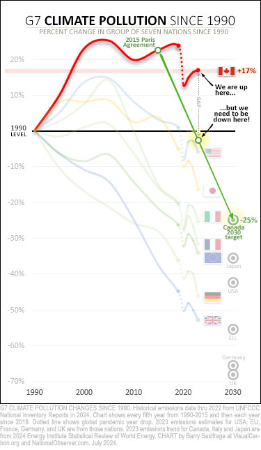
Canada’s target is shown by the green bullseye on the chart. It works out to 25 per cent below our 1990 level. The other G7 targets are shown with gray bullseyes. As you can see, Canada’s is the highest, because we’ve let our emissions rise the most.
Canada's direct path to the target from the 2015 Paris Agreement is marked with a green arrow. That’s the path requiring the smallest emissions cuts per year.
If we’d taken that direct path, today we'd be down with the Americans — our emissions a bit below our 1990 level. That’s marked by the white dot halfway down the green arrow.
Instead, we wasted the years after the Paris Agreement. Even our huge emission drop in 2020 forced by the pandemic wasn’t enough to get us back on track.
And then, three more wasted years of rising emissions exploded that gap from where we need to be. That's the brutal math of climate foot dragging: The penalty for each wasted year grows dramatically larger as the deadline approaches. Now, with less than seven years remaining, the cuts we need to make have become wildly unprecedented in Canada.
Unprecedented cuts now needed
My next chart shows how fast our foot dragging is pushing our target out of reach.
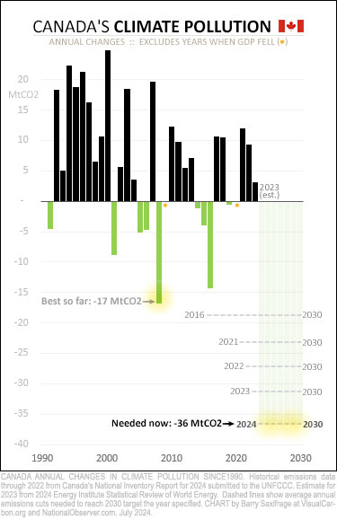
The bars on this chart show Canada's annual emissions changes since 1990. Years with increased emissions are shown by the black bars. Yeah, that's most of them. The size of the increase is shown by the height of the bar.
Years when emissions fell without an economic contraction are shown in bright green. The largest such reduction is highlighted -- a cut of 17 million tonnes of CO2 (MtCO2) back in 2008. Most of this reduction came from cleaning up the electricity sector.
With this history in mind, let’s look at the size of cuts needed to meet Canada’s 2030 target. These are shown on the chart by a series of dashed lines in the lower right.
The top dashed line, stretching from 2016 to 2030, shows that if we had started in 2016, Canada would have needed to cut 19 MtCO2 per year. That’s the direct path shown on the previous chart with a green arrow.
By 2021, our foot dragging had increased our task to where yearly cuts of 23 MtCO2 would have been needed to reach our reduction target. That’s shown by the next dashed line stretching between 2021 and 2030.
The next three years of rising emissions exploded our remaining task to a point where yearly cuts of 27 MtCO2, then 31 MtCO2, and now 36 MtCO2 are needed. This is shown by the plunging series of dashed lines. We are now at the bottom dashed line, stretching between 2024 and 2030. We need seven straight years of cuts that are more than twice as large as we've ever managed to do in any normal economic year. Does that look likely to you?
And remember that the penalty for not acting grows ever larger each year. If we don’t cut at least 36 MtCO2 this year, then our remaining task grows more extreme.
If all that wasn't daunting enough, there’s another aspect of Canadian emissions that makes it even harder.
Our one-trick pony is almost played out
As many readers know, almost all of Canada’s emissions cuts so far have come from one sector — electricity. It’s been our one-trick pony. But now it’s almost played out. My next chart shows what this means for meeting our 2030 target.
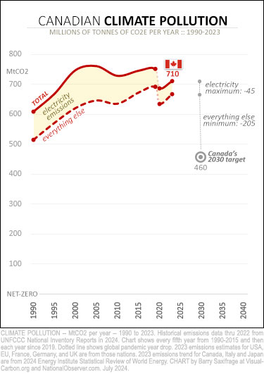
On this chart, Canadian emissions are shown by a solid red line. We currently emit around 710 MtCO2 per year. That’s up from 600 MtCO2 in 1990.
Canada’s 2030 target is shown by the gray bullseye on the right. To meet it, we need to cut 250 MtCO2. Where will those cuts come from?
Just 45 MtCO2 of electricity emissions remain (yellow area). That’s a small fraction of the 250 MtCO2 needed to hit our target. In fact, there are so few electricity emissions left that even if we eliminate all of them it won’t be enough to even get us back to our 1990 starting-line.
That means nearly all our emissions cuts now must come from everything else outside our electricity sector. Those emissions are shown by the dashed red line on the chart. Notice anything troubling about this line? Yep, it has been rising relentlessly for decades. These emissions were record-busting high when the pandemic hit. And they've shot back upwards since. This is an emission supertanker running full steam in the wrong direction.
In the past, cutting electricity emissions hid this rise. Now, as this source dries up, our "everything else" emissions trend will dominate.
Canadians have spent 35 years promising to cut our oversized emissions. But we still haven’t done the most basic work to bend our core emissions curve in the right direction.
This failure was a choice. We know this because — as we’ve seen clearly in the earlier charts — many of our advanced-economy peers have been cutting their emissions for decades now. If they could do it, we could too.
So, I’ll wrap up this article by looking at one such example to see some of the key climate policies that have worked for them.
Carbon budgets guide U.K. emissions down
Here’s the same chart I just showed above, but with U.K. emissions instead of Canada’s. The U.K. has an even larger economy and population than we do and, back in 1990, they also emitted a lot more. Since then, they’ve rolled up their sleeves and done the work needed to cut their emissions. Take a look.
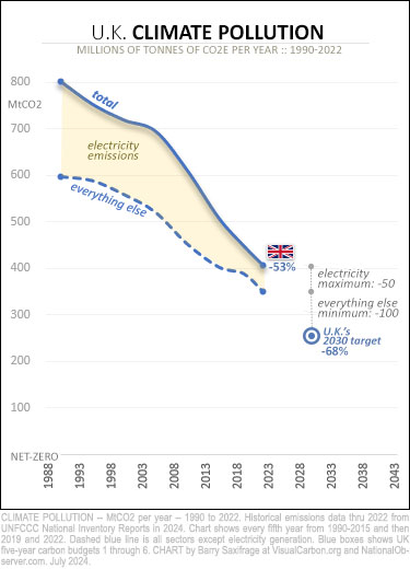
The solid blue line is their total emissions. They’ve cut their emissions in half — from 800 MtCO2 in 1990 down to 400 MtCO2 now.
Like Canada, they have relied heavily on cutting electricity emissions (yellow area). And, like Canada, their electricity emissions are now nearly dried up. So, they too need to get nearly all future cuts from other sectors.
The obvious difference with Canada, is that they’ve also been cutting emissions in all the rest of their society and economy. They turned their “everything else” supertanker downward decades ago (dashed line).
The U.K. target for 2030 is shown by a blue bullseye. It's an impressive two-thirds below their 1990 levels. As you can see, they’re already headed in that general direction. They need to continue to bend their curves downwards some more. But that’s what they’ve been doing for decades. They don’t need to radically reverse course like Canada does.
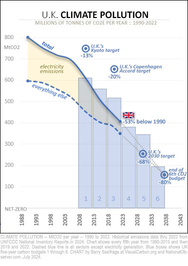
A major reason the U.K. has stayed on track is their legally binding five-year carbon budgets. I've added these budgets to the chart as violet boxes.
Enacted as part of their landmark Climate Change Act 2008, this law requires budgets covering all yearly emissions, starting immediately with 2008.
The law also requires the government to enact policies that meet these budgets, a mandate sorely lacking in Canada.
Equally important, the U.K. demands that policies be put in place many years in advance. This gives citizens and businesses time to plan for what’s coming.
Currently, the British government is working on policies for their sixth carbon budget starting in 2033. This budget requires the nation to lower emissions to 80 per cent below 1990 levels by 2038. That’s shown on the chart by the lowest blue bullseye.
As the chart shows, the U.K.’s carbon budgets have been guiding their emissions consistently downward. That's helped them to meet their Kyoto (2010) and Copenhagen Accord (2020) targets. And you can see how their sixth carbon budget is keeping them on track for their Paris Agreement 2030 target and setting them up to achieve the critical net-zero target before 2050.
We've been watching our Commonwealth peers in the U.K. successfully cut emissions for decades. We could have adopted their successful policies at any point. So far we haven't. Our multi-decade failure to reign in our emissions has stranded Canadians high up the crumbling climate cliff. Now, the gathering climate storm is starting to lash out physically and economically.
Our sky-high emissions have put us in a dangerous place. Canadians need to stop foot dragging and start catching up with our G7 peers as they climb down towards safety.



Comments
Get rid of carbon pricing because it's not working. Regulation time.
Now do emissions by provinces.
Did you factor in the offshoring of emissions by UK and others? Some portion of reductions in the UK has simply been displaced to other jurisdictions. We need better accounting of these flows.
Also the UK claims biomass is part of their reduction in emissions which is questionable to say the least.
One of the reasons for shipping bitumen out of the country to be refined is Canada doesn't claim the emissions from refining it. The U.S. has been refining most of the bitumen until now. The trans-mountain pipeline will give those emissions to Asia. Eventually these countries aren't going to want our emissions.