Support strong Canadian climate journalism for 2025
Despite decades of promises to prevent a climate crisis, the primary cause of it — global fossil fuel burning — continues to increase rapidly. Last year's record-breaking burn was a doozy.
That's according to data in the latest "BP Statistical Review of World Energy."
And renewable energy — a hoped-for climate solution — has not only failed to halt the explosive rise in fossil carbon burning, it's falling ever-further behind.
I've dug into the latest BP energy report and created 10 charts that illustrate humanity's high-octane acceleration off the climate cliff.
The burning keeps rising
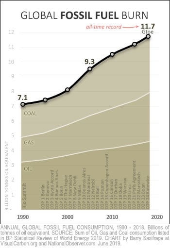
My first chart shows the amount of global energy produced by burning fossil fuels each year. As you can clearly see, humanity just keeps burning more and more.
If this seems surprising to you, it could be because the BP report doesn't have any charts or tables showing total fossil fuel use. To create this and the other charts for this article, I had to download and combine separate spreadsheets for oil, gas and coal.
Back in 1992, the world gathered at the Rio Summit promising to prevent fossil fuel pollution from unleashing a full-blown climate crisis onto future generations. As the chart shows, humans burned 7.1 billion "tonnes of oil equivalent" in fossil fuels per year back then.
Note: A "tonne of oil equivalent" (toe) is an energy metric equal to ~42 gigajoules that BP and others use to compare different sources of energy. An "Mtoe" is a million "toe" and a "Gtoe" is a billion "toe."
Since that original global climate conference, there have been 24 more, as shown on the chart. And yet, as the chart also makes clear, the amount of fossil fuels burned each year hasn't gone down. It hasn't levelled off. It has only surged upward.
Last year, the fossil fuel pyre jumped to another record — 11.7 Gtoe. Both oil and gas burning also set new records. Even coal burning, which fell slightly for a few years, has started rising again. Its now just two per cent below its all-time high. To paraphrase Mark Twain: rumours of its death have been greatly exaggerated.
In total, humanity now burns two-thirds more fossil fuels than in 1990.
Do you see any hint of "climate progress" in that data? I sure don't. I see the very opposite.
It's no wonder millions of children around the world are growing afraid of what the adults are doing to their future and have started "school striking" to try to save themselves. Or that extinction rebellions, birth strikes and climate despair are emerging.
As Greta Thunberg, the teenage Swedish climate activist leading the school strikes, recently said: "We are facing a disaster of unspoken sufferings for enormous amounts of people... We have to acknowledge that the older generations have failed... it is now time for civil disobedience. It is time to rebel."
Half since 1990
To appreciate just how extreme the burning has been in recent decades, it helps to see it in the greater context. My next chart shows just that. It shows cumulative global fossil fuel burning since humans started doing it in earnest with the industrial revolution.
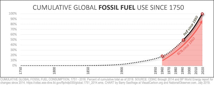
The solid black part of the line shows that half of all fossil fuels burned in human history have been burned since 1990. This has occurred during the "climate crisis" years in which adults understood the threat it posed, and repeatedly promised to do something about it.
In fact, more than 80 per cent of all fossil fuel burning has occurred during the lifetime of the "baby boomer" generation. That's my generation. We got to enjoy the amazing benefits a stable climate provides.

Instead of safeguarding this heritage to pass along to future generations, we've set it on fire. And each year, we make the pyre even bigger.
What we are passing down to younger generations is a turbocharged climate Hydra which is starting to lash out at humans and the ecosystems we depend on.
In the Greek myth, Hercules fought the Hydra. In our modern reality, we are feeding ours ever-greater amounts each year. The serpents of drought, heat waves, floods, rising seas, super storms, wildfires, acidifying oceans and eco-collapse keep growing more powerful and aggressive.
Renewables, wherefore art thou?
What about renewable energy?
One of the great climate hopes has been that rising amounts of renewables and nuclear energy would cause fossil fuel burning to start falling.
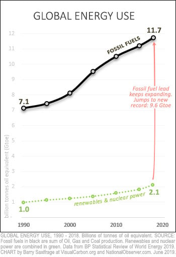
My next chart lets you see what happened instead. The green dotted line shows how much climate-safe energy was used each year. This line includes the BP data for renewables (like hydro, solar and wind) as well as nuclear energy.
Climate-safe energy did indeed increase significantly since 1990, rising by 1.1 Gtoe.
But humans increased fossil fuel burning four times more.
Climate-damaging energy use is not just rising. It is pulling away from the climate-safe alternatives.
Fossil fuel's lead has widened from 6.1 Gtoe in 1990 to 9.6 Gtoe today.
In practical terms, this means that each year, the amount of clean energy that must be added to replace fossil burning keeps getting larger and larger — not smaller.

In a Greek myth symbolizing futility, Sisyphus kept moving a boulder to the top of a hill only to have it roll down again, forcing him to do it over and over.
Humanity is stuck in the same endless cycle, trying to build enough new clean energy to replace dirty energy. Except in our modern version, the size of the clean-energy boulder that needs to be shouldered keeps getting larger each time.
Despite the task growing ever-larger, Bloomberg just reported that worldwide investments in clean-energy projects have fallen yet again, to a six-year low. Clean-energy investments declined in all three major markets — the U.S., Europe and China.
At this point, it is just another form of climate denial to expect clean energy to force fossil fuel burning to fall — let alone fall all the way down to zero as required to avoid a climate crisis.
Year by year
My next chart shows the annual changes in global energy use.
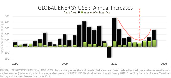
As the black bars show, fossil fuel burning has increased in 27 of the past 28 years.
The only outlier year was 2009, and that was caused by a sudden global recession. The very next year, however, fossil burn rebounded with the biggest increase in human history.
For a few years after this, the annual increases in fossil burning were getting smaller. Hope flickered briefly that the fossil burn might stop increasing. Adding to this hope was the global Paris Climate Agreement in late 2015, in which the entire world promised to increase climate ambition.
Unfortunately, as the red arrow on the chart makes clear, as soon as the ink dried on the agreement, the world reversed course and started increasing the increases in fossil fuel burning.
And last year, humanity's sprint away from climate safety accelerated yet again as the global fossil burn jumped to fill two-thirds of new energy demand.
Renewables, in contrast, stumbled last year. According to the BP report summary, in 2018, "all fuels grew faster than their 10-year averages, apart from renewables."
When down really means up
But, aren't fossil fuels losing market share? That's a sign of climate progress, right? Unfortunately, it isn't. To understand why, take a look at my next chart.
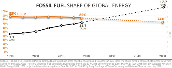
The orange line shows fossil fuel's share of global energy use. It fell three percentage points since 1990. However, the black line shows that the actual amount of fossil fuels burned rose dramatically. The mathematical reason why these both could be true is that global energy use expanded faster than fossil did. As a result, the larger amount of fossil took up a slightly smaller share of the even larger energy pie.
Unfortunately, the climate doesn't care what share of the energy pie fossil fuels have. The climate only reacts to the total amount of fossil fuels we burn — that's the black line on the chart. And as long as that black line is rising, we are accelerating away from climate safety.
To avoid a full-blown climate crisis, that black line must fall to "net zero" by 2050 or sooner. That's according the latest and best science in the IPCC Special Report on 1.5 C.
Unfortunately, we are still headed in the opposite direction. The dotted lines on the chart show where we will end up if we continue with the global energy trends since 2010. Fossil burning will continue rocketing upward, even as its share keeps falling.
Who cut back? Who burned more?
So far, we've looked only at data for the world as a whole. Next, I'll drill down into the BP data to show what Canada and some other countries have done.
There are 200 countries, so to keep the charts manageable, I'll focus on just the G20 countries, which includes the European Union (EU). Collectively, these countries account for roughly 90 per cent of global GDP and fossil burn.
Amount burned per capita
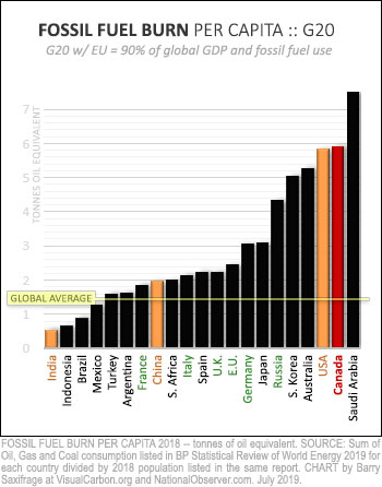
My first G20 chart shows fossil fuels burned per capita last year.
India burns the least per person, at less than half the global average.
The Chinese and Europeans are in the middle of the pack. They all burn more than the global average.
Canadians and Americans are at the extreme end — burning four times the global average. Only the Saudis, in dead last, burn more than we do.
Back in 1990, Canadians burned much less than Americans, per person. Now, we burn more than they do.
Changes per country
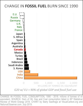
My second G20 chart ranks countries by the amount they have changed their fossil burning since 1990.
At the top, in green, are countries that reduced their fossil fuel use. These are the major European economies and Russia.
Obviously, it's possible to cut fossil fuel use. These major economies have done it.
Canada is in the middle of the pack, in red. We increased our annual burn by 57 Mtoe.
At the bottom of this chart, in orange, are the world's three most populous countries. Combined, these three accounted for two-thirds of the global increase in fossil fuel burning. China alone accounted for around half the global increase.
Change per person
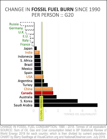
My next chart shows the same country changes — but this time divided by their current population.
This lets you compare what has happened on a person-to-person basis.
As you would expect, the biggest shifts in the rankings are for the world's most populous countries. China moves off the bottom, but still has an increase far above the global average. The U.S. moves to the middle. And India moves even higher.
Canada falls toward the bottom.
Canada's much larger increase than the U.S. since 1990 explains why we've now passed them up in the amount we burn per capita.
Oh, Canada
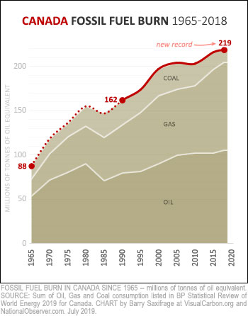
Let's drill down one more level into the BP data to get a more detailed view of Canada's fossil fuel burning history.
The resulting chart on the right shows the amount of oil, gas and coal we've burned each year since 1965.
The first thing that jumps out is that Canada just keeps burning more and more as the years go by.
Last year, we set an all-time record by burning 219 Mtoe worth of fossil fuels.
Canada's coal burning has fallen to less than half of what it was at its peak in 2002. But all that climate progress has been more than wiped out by surging oil and gas burning. Fossil oil burn has grown by a third since 1990 and fossil gas burning has nearly doubled. Both are still rising, driving total fossil burn to record heights.
What now?
Where could Canadians look for ideas to reduce our fossil burn?
My final chart compares Canada's fossil burn to those from three of our closest allies. It shows changes since 1990.
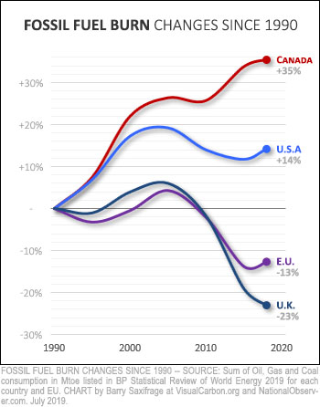
The U.S. and the EU are the world's two biggest economies. Fossil fuel burning in both appears to have peaked more than a decade ago.
If they can stop increasing fossil fuel burning, surely Canada can as well.
The Europeans, in particular, have made significant cuts in fossil fuel use since peaking. We could adopt some of the climate policies that are working for them.
And our commonwealth peer, the U.K., has done even better. They've enacted an innovative carbon budget law that is designed for climate success. We could enact the same kind of law here.
Canadian politicians like to say that we are world leaders in the climate fight.
The energy data in this BP report shows the opposite. It shows that Canadians burn more fossil fuels per capita than almost any other country. And it shows that instead of cutting back as required to prevent a full-blown climate crisis, we just keep burning more and more.
If Canadians want to pass along a safe and sane climate system to our future generations, we will need to quickly change course. Many of our peer countries peaked fossil burning years ago and have policies we could adopt.



Comments
Ok....I'm going to go out of my mind !
Homo sapiens claim to be an intelligent species. Maybe so, but, we are certainly not very smart. We are the main driver behind our own likely extinction as a species. Greed continues to dominate common sense as we focus on quarterly income statements, balance sheets, corporate bonuses and consumerism as mainstays of our daily activities.
There is a price to be paid for climate change. Who will pay it? Our grandchildren? Our children? Us? or all three?
Not us. Our children & grandchildren.
It is up to us to rally. Pressure politicians.
Change our driving and transportation habits, quit pointing fingers and talk about it to everyone to the extent the government makes a war against the climate crisis.
We've been paying for it for years now ... it's just that absent living where the climate extremes have triggered significant property damage, it's been fairly easy for people to not notice it.
A/C, auto-pay utilities bills, sufficient income for necessities, etc. make all those incremental changes over the years harder to notice.
As has been pointed out numerous times (mostly by Elizabeth May), most of Canada's carbon footprint is generated by a handful of heavy producers in the oil/gas, cement, and, and transportation industries, and as such, a concentrated legislative focus on these heavy hitters could easily make major inroads in our carbon output as a country. Obviously, approving and paying for new pipelines such as TransMountain, which only expand Canadian oil/gas activity, is a hugely regressive policy.
Clearly though, most of the fossil fuel consumption increase is coming from the growing economies of India, and especially China, and that has to stop. Foot-dragging by the US, being the world's largest economy, also has to be a major area of focus.
While Canada has historically had a big effect on world affairs as a progressive example, we certainly haven't been that on climate change, and that needs to change. A good place to start making that change is with the next federal election.
India is the least abusive! Read the graphs..
It is OUR use that has accelerated.
Pay attention. Please.
Could you break down that horrific figure for Canadian fossil fuel burning? How much comes from: Heating? Transportation? Industry? Tar sands extraction? And does it include emissions from the customers for tar sands bitumen?
Sell your car. Pressure politicians. Will the breakdown change your behaviour and choices?
Selling my car is not an option for me or most Canadians but a small but important step should be incentives to switch to electric transportation - personal and commercial use - cars, trucks, busses, aircraft etc.
I've heard lots of people say they absolutely need a car, with no elaboration. And yet, millions of Canadians live without one, in both urban and rural areas.
And many also say they *must* have a recent-year vehicle ... not because they plan on keeping it for a long time, or because of better gas mileage or lower manufacturing outputs, but usually, when pressed, it comes down to they feel it is an entitlement of the economic status they've attained.
When push comes to shove, almost all of the increase since 2005 comes from the tar sands.
Check out the whole series of articles by Barry Saxifrage. He has produced some incredibly enlightening diagrams!
Looks like Canadians don't get it, why we are not sure, the last time they made sacrifices was WW 2, rationing, growing gardens no overspending on personal items, is that what is needed to get people out of SUVs, get the politicians out of jet planes, elect someone who has a grip on reality. Pretty sad.
Yes. Exactly.
OUR CLIMATE TELLS US TO ACT ...OR PERISH !
There is little indication that the Liberals or Conservatives will address the carbon footprint issue, head on. Could/should the ‘ lesser’ political parties ,with a creative climate action plan, gain sufficient electoral support to upset our political apple cart ?
A somewhat similar climate incident occurred in the 1980’s, when acid rain was created by electric power generating plants that burned high sulphur coal… after much debate scientists were able to convince political leaders to switch to ‘cleaner’ natural gas. Remember call in earlier days, when coal was the major heating energy source…. Guess who saved us then…a cousin of the fossil fuel industry…the petroleum industry ! I remember how happy we were when the old wood/coal furnace was retired and new natural gas furnace was installed ! Overnight the air became cleaner! Nature has a way of adjusting to interference…but unfortunately we have reached the limit now because of the overloading the atmosphere carbon dioxide…
The petroleum industry, along with much research, has left us where you cannot eat, wear, or see anything that is not at least partly created with petroleum derivatives….! Now let the industry work with governments to help fix the carbon footprint …! New ‘energy ‘concepts are appearing …what about Small Modular Reactors(SMR), modern nuclear power ,ITER ,wind ,solar .geothermal, retrofitting…Opportunities galore for everyone ! Is ‘oil’ up for the challenge or have they chosen the route of the long forgotten buggy whip industry ?
What’s required is a challenge to the many technical groups that reside in universities, Government and industry.
With much luck, planning, sacrifice ,hard work ,we managed to win WW2…This Climate War seeks another FDR, Winston to lead us …now !
Carl Shalansky, P. Eng. (Retired)
Blog: https://redfern3359.wordpress.com/
(604) 986-4657
Yes. In the meantime, hope you are pressuring politicians, driving a hybrid or taking public transportation/
There is a federal election in October - vote Green!
We "won," yes: those of us who didn't have loved ones who never came back, or are too young to remember.
What you say is true. However for us to curtail our oil exports from this country does nothing for anyone! Quite the contrary. If we do not fill the market with our product, someone else will. We have a market opportunity on the Trans Mountain west improvement giving us access to China, Indonesia and even Australia. Shipping from the east coast adds too much expense we wouldn't be competitive. If we do not ship; someone else will!
To quote my mother, when her kids were teenagers:
"I see. And if everyone else jumps in the lake, will you do it too?"
The truth of the matter is that doing the right thing does not depend upon anyone else!
And if someone else sells the oil, that's not on us, now, is it?
The truth of the matter is that most of the population has been making changes (aka "sacrifices") for decades now, and the petro industry wipes out all the gains we've made. Why should the 85% of us in non-tar-sands provinces, and the significant numbers of the 15% in the "have tar" provinces put up with the bogus reasoning that it's worth burning the entire planet, to the extent that we are justified in producing/burning 4X the per capita share of the rest of the world ... and all so that a few people draw unreasonable pay in between when their towns burn down, so that shareholders get mighty dividends, and executives get huge paycheques and bonuses ... and oh yeah, so that a few politicians get big cheques for their re-election warchests?
No!!!
Just ... *NO* Enough is enough, and too much is too much! (That's also quoting my late mother, in the same era) ... and we're already far past too much.
Please quit spouting bogus and irrelevent "logic" that a 10 year old in my day would realize was faulty!!!
We're better than that, and smarter than that. And we care more about our kids and grandkids than that, and the people in the rest of the world. Not to mention the rapidly reducing numbers of species.
I'm not going crazy. I'm getting really Pee-Oh'ed.
Isn't that a bit like saying if we don't rape the girls in Mexico, someone else will?
Get a grip, please!!!
There are people who sell all their stuff and give away all their money, and take up life as a mendicant.
Any takers for that one?
John Clark - whoever you are and whatever you represent - your comment now ranks with those of the criminally egregiously ignorant and blinkered apologists for the poison that is killing the earth. If we don't do it, someone else will? What a piece of schoolyard "logic". Even China and India are thinking about abandoning fossil fuels. Their respective pollution indices are through the roof and their people are increasingly crippled by it. Except for the monsoon season India is blessed/cursed? with abundant solar power. China's land mass can support an untold amount of solar and wind energy. Either we change course, or we exterminate ouselves and most other life on earth. Do we really have a choice?
Barry
This is a great documented piece. I look forward to more of your work.
Allow me to name two elephants in the room. First, all economic value creation requires energy, so the current economic model's requirement for continual exponential growth is a big part of the problem (and the reason the only drop in 28 years was the global recession). Second, there are simply too many humans for the planet's ecosystem to support but no one will grapple with this issue because of reproductive rights and fewer humans would consume less (and therefore hurt economic growth). So our leaders are trying to figure out how to reduce the main drivers of economic growth using an economic model that demands exponential economic growth -- time to change the economic model to one that serves humanity better (read Donut Economics).
A final observation: renewable energy fights climate change if and only if it results in fossil fuels staying in the ground. That is why the responsible thing to do is to stop all extraction from the tar sands as one of the world's dirtiest sources of fossil fuels.
The last paragraph is utterly true. The two elephants are fallacies.
There *is* such a thing as sustainability ... and the world's population has been levelling out in burps, fits, starts and bumps since WW2.
Google Hans Rosling's great presentations on the matter on TouTube.
The only problem with a sustainable economy is that it doesn't provide massive profits for some, and not enough to live on for the rest. That is the real elephant.
We're taking too much, mining all of the Earth's resources, living and non-living. The bioproductivity of the planet is less than 3% per year, yet successful industries and investments demand double-digit annual returns. This "free lunch", aka bubble, means using, for example, much more fresh water than Nature can provide and clean up for us each year. We pumping acquifers dry, using up the rapidly melting glaciers, and getting buckets of rain from the heated, saturated atmosphere that runs off over-paved cities and takes away agricultural soil that's the wind is already depleting alarmingly every year. And that's just one for-instance.
Which is to say, the crisis isn't, at its roots, about carbon -- i.e. if we lower carbon use to reduce Earth's fever, then we can carry on taking too much with renewable energy. Fossil fuels just grease the wheels of our greed and trashing. The question is: which is stupider, to outstrip Nature's ability to provide and replenish using dirty fuels, or keep taking way too much with clean, green energy?
The beauty of the dirty, climate-changing stuff is that it creates the fever, which gives us a powerful clue that some underlying thing we're doing is wrong, like the fever that accompanies a serious disease or injury, telling us that bodily systems are under attack. We don't just lower the overheating person or animal and consider the infection or injury solved.
It's strangely deluded to think that addressing the planet's fever will fix, in any meaningful way, what's causing the problem. We can't continue to operate on a business model that takes profits by digging into core capital.
We have to figure out what's enough and live within Earth's means. We need to factor into every decision, individually and connectively, the cost to the Earth. We need guidance in this, which research, governments, and educators can provide. The McKinlay family motto & crest that I grew up with, "Not Too Much", has all the salvation in it we need, and it's a beautiful thing, full of satisfaction with enough.
Not likely? Well, then, get used to what General Dick Little of Frank [satire] Magazine used to say: "It was us against the environment, and we won."
The post-war peace dividend in hand, and taking that and the earth both for granted, will this (and its embodiment in Donald Trump) be what the ´me’ generation is most remembered for?
Give peace a chance? Really? It’s more like distract me from reality and encourage me to consume mindlessly by wrapping my food and everything else in my life in plastic. Yeesh.
It’s still not too late to start to fix this, but the time for pretending to try is over.
I'm not quite sure how one might use up too much sun or wind ...