Support strong Canadian climate journalism for 2025
“Whatever our world leaders are 'doing' to reduce emissions, they are doing it wrong … Our political leaders have failed us … We have to understand what the older generation has dealt to us, what mess they have created that we have to clean up and live with.” — Greta Thunberg
The primary force overheating our planet, destabilizing our climate, and acidifying our oceans is the CO2 humans are dumping into the atmosphere.
Despite decades of Earth Days, international climate summits and even an epic economic contraction caused by a global pandemic, the amount of CO2 piling up in our atmosphere hasn't stopped rising. Or even slowed down a bit. Instead, CO2 levels have continued to accelerate upwards, unchecked.
That's the dismal story revealed by the most recent CO2 data from the United States National Oceanic and Atmospheric Administration (NOAA). Take a look.
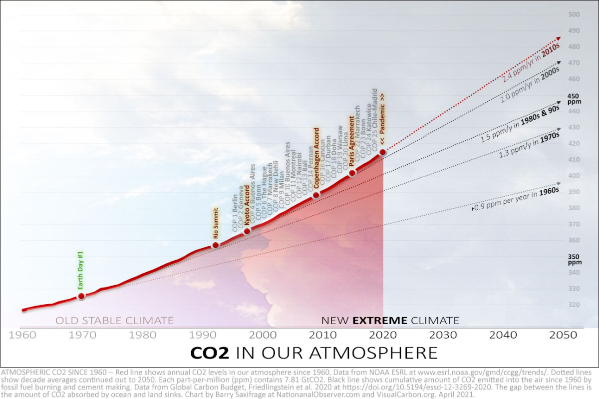
The bold red line in my chart shows the surging level of CO2 in our atmosphere since 1960. You can easily see the accelerating rise by looking at the dotted lines I've added. These show how fast CO2 was rising in each decade.
For example, in 1970, as people rallied for the first Earth Day, humans were increasing the CO2 in the atmosphere by an average of 0.9 parts per million (ppm) every year.
By 1992, when the world's nations gathered for the Rio Summit, humans were increasing it by 1.5 ppm per year — 60 per cent faster.
Now, after a quarter century of international climate summits (officially called United Nations Conference of the Parties, or COPs), we are increasing CO2 in the atmosphere by 2.4 ppm per year — nearly three times faster than during that first Earth Day. And last year, during the global pandemic, CO2 rose even faster still, by 2.6 ppm.
You can see why kids like Greta Thunberg have become so frustrated and mad. We are literally accelerating their generation into a chaotic climate future. At this point, the only thing rising faster than CO2 is the growing heap of broken promises to do something about it.
"We have let down the young generation, and they know it, and they are angry." — Sir David Attenborough
Fossil fuel burning crisis
There is no mystery about the primary cause of this accelerating rise — burning fossil fuels. My next chart shows this clearly.
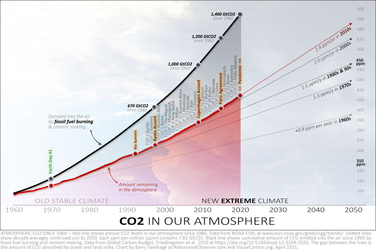
The bold black line I added to the chart shows the cumulative amount of CO2 dumped into the air since 1960 from fossil fuel burning, plus a bit from cement making.
As you can see, that black fossil fuel pollution line has accelerated upwards, as well. In fact, the top 10 greatest fossil fuel burning years in history were 2010 to 2019 — with each year breaking the record set the year before.
Yes, global fossil fuel emissions fell a bit in 2020 because of the worldwide recession brought on by the COVID-19 pandemic. But it was such a little blip in comparison to the surging trend that you can't even see it in the chart. And by December 2020, the world's fossil fuel CO2 emissions had already surged back up to record-breaking highs.
Ocean acidification accelerating, too
As that chart also shows, only some of the fossil fuel CO2 we release into the air stays up there. Where does the rest go?
Roughly a quarter of the CO2 we release gets taken up by increasing growth of bacteria, algae, plants and other photosynthesizing lifeforms.
Another quarter of our fossil fuel CO2 dissolves into surface waters, driving a lake and ocean acidification crisis. Our CO2 has already increased global ocean acidity by 30 per cent.
This acidification is causing widespread harm to many marine species, from corals to oysters. According to NOAA, the pace of ocean acidification is accelerating, as well. And if we continue with business-as-usual fossil fuel burning, they say that within the lifetime of today's kids, ocean acidification levels are projected to reach a level last seen millions of years ago in the Miocene, when they fuelled a global extinction event.
The increases keep increasing
My next chart breaks it down further to show the annual amount of CO2 the atmosphere gained in each year.
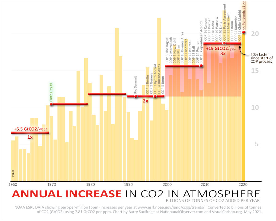
Notice how CO2 levels have increased in every single year.
The big swings seen in individual years are mostly because oceans temporarily absorb more CO2 in La Niña years, and absorb less CO2 in El Niño years. When climate data is "noisy" like this, scientists use long-term averages to see the underlying trends. The red bars do this by showing the decade averages.
These red bars show the relentless trend of the increases continuing to increase. That's what accelerating climate failure looks like.
As the leftmost red bar shows, back on the original Earth Day, the atmosphere had been gaining less than seven billion tonnes of CO2 (GtCO2) in an average year. That was enough to raise the concentration in the air by around 0.9 ppm per year. (Carbon math: 1 ppm = 7.81 GtCO2.)
By the 1990s, the decade that brought the Rio Summit and the Kyoto Accord, the atmosphere was gaining around 12 GtCO2 per year. Over the next decade, featuring the ill-fated Copenhagen Accord, CO2 poured in by an average of 15 GtCO2 more each year. And in the last decade (that included the global Paris Agreement), the atmosphere gained nearly 19 GtCO2, on average, each year.
As the chart also shows, last year, despite lower fossil fuel emissions during the global pandemic, the atmosphere gained more than 20 GtCO2, a near-record amount. This happened because a strong La Niña event caused the oceans to absorb a slightly smaller percentage of the ~34 GtCO2 we emitted from fossil fuel burning that year.
This serves as a reminder that humans are burning enough fossil fuels to double the rate the atmosphere is gaining CO2. We are critically reliant on the carbon sinks in the oceans and land to remove half of it and prevent even faster acceleration of global warming. Climate scientist James Hansen has warned many times that there is no guarantee these sinks will continue at current levels if we keep pushing the climate shifts to ever more extreme levels.
100 times faster
To put these increases into context, take a look at the dashed red line I added to the bottom of this chart.
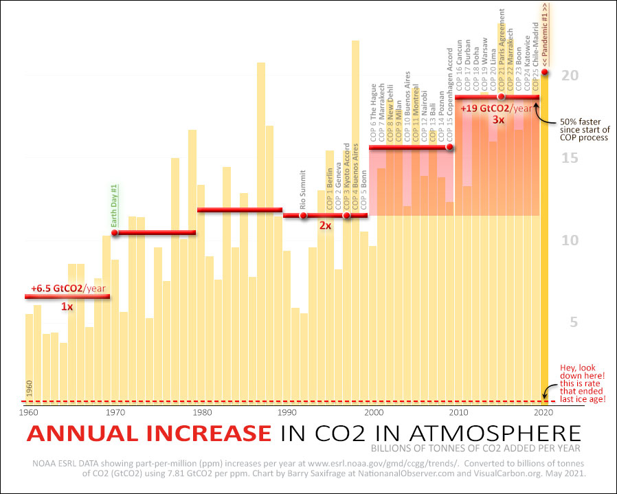
According to NOAA, “the rate of CO2 growth over the last decade is 100 to 200 times faster than what the Earth experienced during the transition from the last ice age. This is a real shock to the atmosphere.”
During the last ice age, all of Canada was buried beneath a massive northern ice cap. The ice was two miles thick over the Montreal region, and a mile thick over Vancouver. So much water was locked up in ice that global sea levels were 125 metres (410 feet) lower. That frigid global climate was heated up into the balmy one human civilization blossomed under with just that tiny trickle of CO2.
Now we are flooding the atmosphere with CO2 a hundred times faster. And rather than cut back, we just keep pressing harder on the fossil fuel accelerator.
Young people's burden
The unmitigated, ongoing failure by the current generation to rein in our climate pollution is forcing an ever-growing burden onto future generations.
We've used their future atmosphere and oceans as an open sewer for our billions of tonnes of fossil fuel pollution that we don't want to clean up ourselves. For scale, we dump 1,000 times more climate pollution into the environment each year than we do with our other big fossil fuel waste product — plastic litter.
It has gotten so extreme that the latest climate science now says the younger generation will almost certainly have to remove massive quantities of CO2 from the atmosphere and oceans to prevent long-term dangerous climate impacts. Not just "net zero," but the even more daunting "net negative."
How can they do this if we can't? How much will it cost them? Is it even possible?
A group of climate scientists, led by James Hansen and Makiko Sato, have studied just this question. Their peer-reviewed science paper, Young People’s Burden: Requirement of Negative CO2 Emissions, concludes:
"… The GHG climate forcing is not only still growing, the growth rate is actually accelerating … if large fossil fuel emissions are allowed to continue, the scale and cost of industrial CO2 extraction, occurring in conjunction with a deteriorating climate with growing economic effects, may become unmanageable. Simply put, the burden placed on young people and future generations may become too heavy to bear."
Here in Canada
As I covered in more detail in a recent article, Canada has been pledging to reduce our climate polluting for 33 years now. But we've never come close to meeting any of our targets.
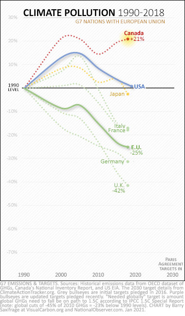
Instead, we've increased our climate polluting by 21 per cent since we started promising to emit less.
As my chart from that article shows, we are also the only member of the G7 that continues to pollute well above our 1990 levels.
Even more troubling, take a look at the most recent decade on that chart — the years when the climate crisis started to hit with increasing fury. Every other G7 country lowered emissions over those 10 years, except Canada. Ours went up.
In fact, our emissions have now risen in each of the last three years the government has released data for: 2017, 2018 and 2019. We are literally still heading in the wrong direction.
A new global poll of teenagers found that Canadian teens top the charts, with 83 per cent calling the climate situation an "emergency." Our kids don't want to live in a climate-ravaged future. Who would?
In my opinion, it is long past time for the Canadian government to do the right thing. That means abandoning the ongoing we-take-no-responsibility approach of only promising distant climate targets a decade or more into the future. That has failed us for 33 straight years.
Instead, Ottawa needs to bring in legally binding carbon budgets that cover every single year — starting with this year. That is not a radical proposal. It is exactly what our Commonwealth peer, the United Kingdom, has done starting way back in 2008. And take a look at where they are now on the chart above.
What is radical is Canada's continuing refusal to cut our sky-high climate polluting even as accelerating CO2 levels push us ever faster into a chaotic and dangerous future.



Comments
These graphs tell an amazing story: where we are and where we're going. We've got to change. First. all Canadian's have to wake up to these facts. Second, we have to mandate a leader to lead us out of this. Third, we have to act as one and do what's needed, and look after each other in the process.
Excellent article; well done.
Skeptic that I am, I went back to the NOOA data and plotted my own graph using Excel. The good news is that I got the same result, the bad news is that the curve has been accelerating through 2020. That said, the extrapolation assumes that nothing will change, so it is a little pessimistic. As to the third chart, the G7 comparisons - these are percentages and Canada is unfairly characterized as do nothing in this context. Our population has grown quite a bit over the target time period (through immigration, importing energy demand from other countries) and, unlike most members of G7, we don't have a bunch of easy coal-fired targets to displace; we don't have a compact geography (mass transit) and we chose not to go nuclear despite large uranium reserves (a good thing too). It's hard to achieve decreases when non-CO2 energy sources like hydro already play such a large part in your economy (BC, Manitoba, Ontario, Quebec). Let's be fair to ourselves while we urge each other on to better efforts - we aren't heroes, but we aren't global villains either.
While I agree that Canada needs to do much more, I can only note the disconnect between the final graph and the graphs and charts previous. In the last, all lines (except for Canada's) are trending down, and Canada is not so major a player as to make up the difference. So, the elephants in the room: China, Russia, and all the other non-G7 countries that are adding to the problem. What's to be done about them?
Entitled Canadians make endless excuses for Canada's dismal performance on emissions. We hear the same arguments over and over (Alan Ball above). Including the oldie but goodie "Little Canada" argument dragged out once again by "Null null" (above).
All these arguments are fallacious.
Canada has a small population of top-ranking emitters. High emitters are the problem. If other nations followed our example, global emissions would skyrocket.
We are responsible for taking care of our backyard. Other nations are responsible for theirs.
Most, if not all, nations have grown in population since 1990.
Canada and the West have exported much of their emissions by outsourcing their manufacturing to the developing world -- not least China.
*
Canadians have an outsize carbon footprint. At or near the top of the list.
Draw squares on a world map, with each square representing 40 million people. The square we call Canada has higher emissions than just about any other square on the map.
Draw squares on a world map, with each square representing 4 million people. The square we call Alberta has higher emissions than just about any other square on the map.
If Alberta were a country, its per capita greenhouse gas emissions would be higher than any other country in the world.
*
The energy hogs and big emitters live over here, not in the developing world.
Canadians' carbon footprint is 3x the global average. Canada's trajectory takes the world over the climate cliff.
Using Canada's nominal (under-reported) estimates, 147 countries emit less GHGs than AB's oilsands industry. 169 countries emit less GHGs than AB. 183 countries emit less GHGs than Canada.
Historically, the industrialized West is responsible for the bulk of (cumulative) emissions and global warming thus far. Canada ranks #9 on that list.
At 1.6% of global emissions (just 0.5% of its population), Canada ranks 10th in overall emissions. (We rank nowhere near tenth in population.) If Canada is "too small to matter," what message does that send to the 183 nations with smaller carbon footprints than ours?
Canadians' ecological footprint > 5 Earths. We all need to live within our means. One Earth.
Some Canadians have footprints far lower than others. Energy hogs need to make make better choices.
Canadians have endless ways to cut energy use, limit extravagance, and reduce waste.
*
Many Canadians drive everywhere they go in single-passenger vehicles in sprawled cities. Idle at drive-thrus. Live far from work and school. Long commutes in bumper-to-bumper traffic. Lights and computers are left on in office towers and homes. Living in big houses stuffed with things they don't need. Shop till they drop. Single-use disposables. Fly around the world for vacations. Holiday in huge RVs. Eat a heavy meat diet. Throw out 40% of their food.
*
Geography? The US and China are extensively populated from corner to corner. Whereas most Canadians live within 150 km of the U.S. border. Two out of three Canadians reside in the Quebec City - Windsor corridor. Most trips are within 12 miles of home. Most of us do not commute to the vast Arctic.
*
Canada has the worst vehicle fuel economy in the world. Canada's vehicles have the highest average fuel consumption and CO2 emissions per km driven (IEA). Canada's vehicles are also the largest and the second heaviest in the world.
Canadians produce more garbage per capita than 16 other OECD nations.
Canada is one of the biggest food wasters on the planet.
*
Canada's ecological footprint is over 5 planet Earths. The average Canadian lives far beyond the planet's carrying capacity. We have a big footprint because we are energy hogs and huge resource wasters, with extravagant consumption habits. We have countless opportunities to reduce discretionary energy use and waste.
Canadians contribute disproportionately to a collective problem; we need to contribute to the collective solution.
The affluent are responsible for the bulk of emissions.
The top 10% income bracket is responsible for almost half of global emissions.
The top 20% income bracket is responsible for 70% of emissions.
The richest half of the global population are responsible for 90% of global emissions.
The poorest half of the global population are responsible for only 10% of global emissions.
"Extreme Carbon Inequality" (Oxfam)
*
"The richest half (high and upper-middle income countries) emit 86% of global CO2 emissions. The bottom half (low and lower-middle income) only 14%. The very poorest countries (home to 9% of the global population) are responsible for just 0.5%. This provides a strong indication of the relative sensitivity of global emissions to income versus population. Even several billion additional people in low-income countries — where fertility rates and population growth is already highest — would leave global emissions almost unchanged. 3 or 4 billion low income individuals would only account for a few percent of global CO2."
"Global inequalities in CO₂ emissions" (Our World in Data, Oct 16, 2018)
• https://ourworldindata.org/co2-by-income-region
*
If you ask the low emitters in developing nations to tighten their belts, global emissions will barely budge.
The biggest bang for our climate action buck is reducing the emissions of high- and super-emitters.
*
Climate change cannot be stopped if only the biggest nations or top emitters reduce emissions.
China, India, and the U.S. cannot solve the problem alone. Even if the top 3 emitters reduced emissions to zero, that would still leave about half of global emissions on the table. Unless smaller national emitters do their part as well, global targets remain out of reach.
"All nations contributing less than 2% of emissions are, cumulatively, more important than India or China. It absolutely does matter that these nations reduce their emissions."
*
Only 4 nations account for more than 3% of global GHG emissions (2015). Together those 4 nations account for 51.1% of global emissions (2015).
If we accept null null's logic, then Canada – along with 192 other nations – has no relevance in efforts to reduce emissions.
But together those 193 nations account for 48.9% of global emissions (2015).
Exempting Canada and other lesser national emitters leaves nearly half of global emissions untouched.
*
Canadians contribute disproportionately to a collective problem; we need to contribute to the collective solution.
So... why are you supporting the Conservative Party and its switch back to the discredited Harper climate plan?
With the Conservatives really not believing in climate change, and O'Toole on Aug 27/21 stating we will reduce or goals that is really stating yup CO2 not a problem. . Then we have 4 Ultra Conservative neoliberal premiers in ON, MB, SK and AB who will do as little as possible . Not a chance Canada will get its act together